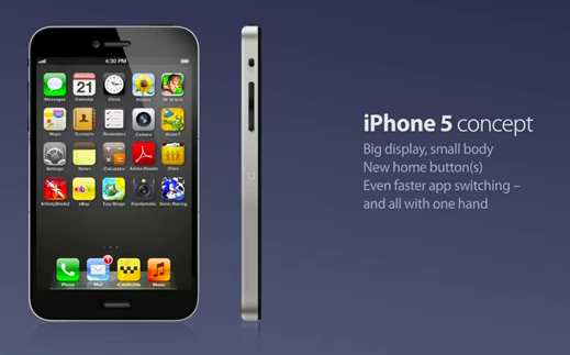
Apple really needs to act on this new iPhone 5 concept; this is all possible because nothing to crazy has been added to this smartphone. Normally people come up with stupid specifications and designs, but this is easily one of the best mock-ups we have ever seen, this one is the wider & missing home button iPhone 5 concept.
At the moment iPhone 5 details, release dates, specs, look are scarce, so everyone comes up with their own concepts to enter the world of “WHAT IF”. Thanks to Kris Groen who is a reader via App Advice has given his version of the next-generation smartphone.
The home button is no longer at the front, instead there are two home buttons on each side of the new iPhone 5 concept, the microphone has moved to the front of the phone, you can clearly see in the video below that the iPhone 5 is wider, it shows 5 apps across now instead of the normal four.
If the two side-home-buttons are squeezed together it will activate the home function, the bottom of the phone will have two true stereo speakers for better sound. If you press the home button on the right side of the phone it will scroll through the phone, press the left it will scroll left, hit the two together takes you back to home menu.
It also features a 4-inch Retina display, 10MP camera, and desktop quality apps.
Check out the video provided below, and let us know what you think. Hey, Kris Groen should ask Apple for a job. Do you like this concept or not?
