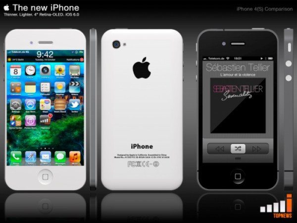
Apple take note as iPhone 5 concept looks realistic
News about the forthcoming Apple iPhone 5 continues to ramp up despite the fact that all we really know about it so far is based on rumors, leaks and speculation. Whilst we like to pass on all the latest developments to our readers we’ve also taken some time to look at some of the amazing concept designs out there for the next iPhone and today we have another iPhone 5 concept that looks pretty realistic.
While some of the previous mockup designs we’ve looked at have been absolutely beautiful to look at, many of them have featured specs that are wildly optimistic to say the least. You can see just some of the examples here, here and here. In fact yesterday we noted that some of these ideas serve to raise expectations of the next iPhone so high that whatever eventually arises cannot live up to what has been hyped. It’s quite refreshing then to see a concept iPhone 5 that has made a stab of being feasible.
The design we’re looking at today comes from Toby Kick of iTopnews.de and was brought to our attention by iDownload Blog. We think it looks really quite stylish and Apple could do worse that to take note of this slimmer design. As you might expect from the growing expectations that the iPhone 5 will have a larger screen, this design includes a 4-inch Retina display and also an aluminum reverse along with 4G LTE connectivity. As you can see then this latest concept has many of the specs and features that are widely rumored rather than diving into the realms of fantasy.
Where this design differs from current speculation though is that instead of being taller than the current iPhone as has been speculated, this one is wider and features an extra row of icons. It also features an enlarged status bar at the top of the display which we think would be pretty good but unlikely all the same. When all’s said and done though we think this is one of the most realistic iPhone 5 concepts we’ve seen so far and we’ve seen a lot of them!
We’d like to receive your comments regarding this latest iPhone concept so please do send them in. Would you like the real deal to look like this? Maybe you’re already expecting more from the next iPhone and would be disappointed if this were an accurate representation? Either way, why not let us know your thoughts on this.


Comments
4 thoughts on “Apple take note as iPhone 5 concept looks realistic”
it just has to work – and to stand apart from the rest that means user experience, which means SIRI has to really get a grip on teh whole phone’s OS – launch apps, take dictation, organise lists, etc etc etc I don’t care what it looks like – it has to work . . .
First we need to look at the design of the old iPhone’s. The iPhone 3G then the iPhone 3GS had the same design. The iPhone 4 and 4S have the same design. So the iPhone 5 (or whatever they are going to call it) needs to have a complete overhaul on its design. Seemingly Apple has been consistent with their design changes from the 3GS to the 4 I would hope that they do something more than just make the iPhone 5 wider and a little bit thinner. I would hope that apple would go with a new outer shell design. I know that some of the new outer shell design concepts are a bit unrealistic but, sticking with the same old rectangular design is getting a little old don’t you think????
So according to your argument Ferrari should make a boxy looking SUV because their slick sporty looking cars they have been making for all these years are “getting a little old.” Should Coca Cola change their receipe after 100 years of making the same flavor because its “getting a little old?”
The “old rectangular design” shell is still by far the best looking shell out there. Obviously they have been selling millions and millions of “old rectangular design” phones every year, so general public still find that shape to be appealing.
Lastly, Apple have always used more of an industrial look for all their products since the beginning of the company. Their usual trick is to start with an extremely industrial look and modify it slightly to make it look modern and slick. Why change your formula when nothing is wrong with it? When you really look at the current Iphone 4/4S, you will see that the design indeed is more industrial, even more then the older iphones. It has sharp edges and flat surfaces. Its designed with minimal curves, very simple and to the point. This is where Apples genius lies; Their theory on aesthetic design is completely opposite of their competition.
How is this the most realistic iPhone 5 concept when the body is the exact same as the 4&4S? Plus, the screen is still a 3:2 ratio, which is completely outdated. If Apple is going to upgrade the screen size, they’re most likely going to go with a 16:9 ratio.. Which would make it easier on the eyes when watching videos on the device.