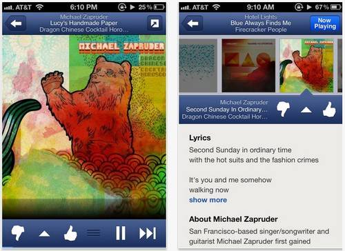
Pandora Radio app interface visual overhaul for iOS
If you are over in the good old US of A and make use of the Pandora Radio app for iOS devices, you might like to know that the Pandora Radio app has now been updated to version 3.2, and the update makes changes to mostly functionality and interface.
According to the guys over at The Droid Guy,, the Pandora Radio app for iOS has been given a visual overhaul with a new blue and white colour scheme, whilst some of the functionality improvements includes the like of…
The user has always been able to rate a song with a thumbs down or up after playing the tune, however with the updated version the user can now go back in the history to rate a song comment on it or purchase it. There is now a new ‘I’m tired of this track’ that when tapped tells the app to skip over that particular track during your current session.
With the latest version of Pandora Radio users can now access bookmarked artists and tunes, and simply tapping on Bookmarks lets you create a new station from your favourites, preview and purchase. Also up until now lyrics haven’t been available in the iPhone application, but this new version brings lyric to the Pandora Radio app that can be viewed by tapping the square icon on the Now Playing screen.
Furthermore apparently the user can now select a new station right from the Now Playing screen, and the update also lays claim to consuming less battery that the previous version, and apparently this latest version of the app has done away with the song length bar.
Thus if you do use the Pandora Radio app for iOS devices, you can hit up iTunes to grab the updated version for free, or if you wish you can subscribe for the advert free version that will set you back 4-bucks a month.


Live Comment
Your email address will not be published.