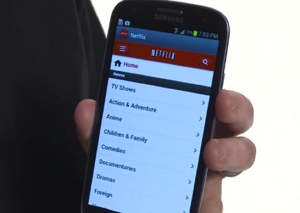
Android phones to finally receive new Netflix UI
Many of you will have heard about Netflix, an on-demand Internet streaming provider, and as more and more of us use our mobile devices for viewing TV and movie content, Netflix has earned its place on smartphones and also tablets. Today we have good news for Android smartphone users as the new and improved Netflix user interface is finally coming to your device and we also have a video preview for you.
The Netflix UI was improved last year and first it came to Android tablets before making its way to Apple’s iPad. iOS users were again next in line when it arrived for the iPhone only last week and now the new UI is being pushed to Android smartphones. Enhancements include larger artwork and also it’s easier to scroll through more titles. The Netflix streaming library can also be accessed now from anywhere in the app and along the top there’s a ‘continue watching’ row showing your most recently viewed content.
Other changes include being able to see more information about a title by merely tapping on it once and also if you want to start playing it you simply need to tap the title twice, according to Engadget. The improved UI is compatible for any Android smartphones running Android 2.3 or later and you may already have seen the update appear on your phone.

You can see the new Netflix experience on Android smartphones in the video below to get a good idea of what it offers and can also see more about the new-look Netflix on the Netflix blog here. The update is free for Netflix members and will go live in the Google Play Store soon.
Why not take a look at the video below and let us know what you think about the improved Netflix UI for Android smartphones by sending us your comments. Are you a Netflix fan?

Live Comment
Your email address will not be published.