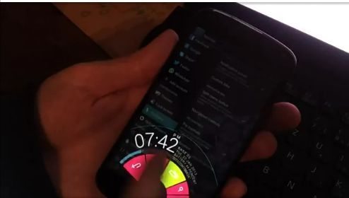
Paranoid Android Pie ROM update is navigational bliss
There are so many custom ROMS out there that allow you to navigate on your Android devices in many different ways, but the best to date is the revamped version of Pie via Paranoid Android. We will let you know a little about the latest Pie status update that provides navigational bliss, stability and a speed bump.
Many would stick with covering CyanogenMod when it comes to custom ROMS such as the recent AOKP, but we have to say and you might agree that the PIE ROM that has been feature-baked into the Paranoid Android ROM just puts a whole new meaning into revamps.
This new PIE update looks amazing as you can see in the video provided below, and is fully-customizable for the stock on-screen navigation buttons that can be found in many recent version of Android. However this PIE does not show on the screen unless you want it to do so, you can have it showing at the top, left, right or bottom of your devices display. Before anyone says “This is not new” we know, but the old betas were a little on the slow side due to test code and now it has been totally cleaned up.

Android Paranoid rewrote the original AOSP control from scratch and now PIE offers all this: Per app color, it has its own theme as well but when switched off it picks up colors you define per app (Watch the video below), Recents key transforms into /// kill-all-button inside the recents view, can be on either of all the four sides, you can even set up multi trigger areas, Displays status information like clock, date, notifications on touch, if you visit the Android Paranoid Google+ page they also mention features such as Rubberbanding for fast navigation, custom panels for notifications and toggles that can be flicked into view, it will not look distorted on tablets and phablets anymore, You can control the animations, even switch them off, and it supports per-app-expand, meaning that it can jump into PIE mode for apps you chose.
One commenter said that they prefer the right side trigger but in doing so the information panel is unreadable unless I turn my phone 90° to the right. This isn’t really practical. Instead of having the information panels curved and dependent on PIE orientation, they could just be straight panels above, below or beside the PIE depending on PIE location. Does that make sense?
Please do watch the video below and let us know what you think.

Live Comment
Your email address will not be published.