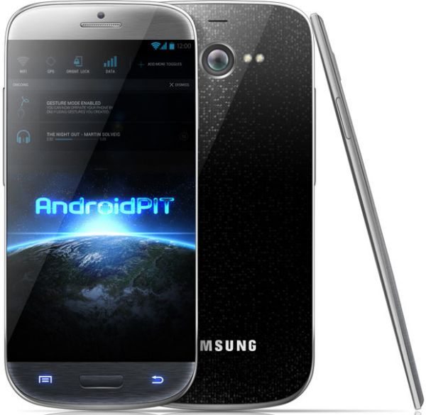
Samsung Galaxy S4 design gains mixed reactions

There is so much talk about the new Samsung Galaxy S4 covering what it will look like and what kind of specifications we can all look forward too, but today we want to discuss about this Samsung Galaxy S4 design shown below gaining mixed reactions.
We posted a Samsung Galaxy S4 photo render on Mark’s Google+ page and got some mixed reactions in what his follower’s said about the design, before we go into what was said we will give you a few details on the Galaxy S4 that looks very much like the LG Nexus 4.
This Samsung Galaxy S4 render shown above includes an edge-to-edge 5-inch Full HD screen and apparently would come with features such as a 1.5 GHz Exynos 5 Octa processor (8 core), 2800 mAh battery, 16 GB of storage as well as coming with a microSD card slot. It would also be nice if these specs were true in the official version; 13-megapixel camera with 1080p video recording, 6.6 mm thick, wireless recharging, 2 GB of RAM, Android 4.2 Jelly Bean but we would prefer Key Lime Pie, but then again we know the S4 will release before the new Android OS is release, or will it?
We had a great response via Google+ and some of the responses were fun to read, one commenter said that the S4 render above is basically a rip-off of the Nexus 4; yet another follower mentioned that they would not like the above Galaxy S4 because it is just a mix between the S3 and Nexus 4 and looks horrible.
When we asked “Would you like this to be the Samsung Galaxy S4?” we did get a few good comments including one readers eyes rolling because they loved it, some suggested that they should get rid of the physical home button but still keep the stock android capacitive buttons so they can root and put android ASOP on there.
If the above interested you please do read our article on the Galaxy S4 huge unit production and how it could hit the likes of the iPhone 5S / 6.
Source – Androidpit (Render by Andrei Salaru)

Comments
3 thoughts on “Samsung Galaxy S4 design gains mixed reactions”
Personally i wouldn’t have a problem with how it looks. They don’t have to change the appearance to much from the Galaxy S3 and Galaxy Note 2. My veiw is if it’s not broke don’t fix it the current Galaxy S3 sold the most out of any current device on the market so it couldn’t have been to ugly at it. In 2013 it’s the internals and software and features that will set the Galaxy S4 from the rest. They better come with that 32gb or 64gb option in storage and they better throw in the capabilities of the device housing that 128gb sdxc card that they introduced to the market at CES this past January. Would be if it also came with android 5.0 Key Lime Pie but clearly it won’t because of it’s release date in Korea but who knows the states might see key Lime Pie launch on the Galaxy S4 if it is released on all carriers in May/June 2013. Either with these hopes that I have for the Galaxy S4 it would serve many well and be one of the TOP DEVICES in 2013 first half at least. Samsung better realize that Motorola is coming with that Motorola X phone and it will have 128gb of storage option with a removable battery those are the hallmark of android sd card slot options and removable battery option.
Oh my… Techno Lust… and I am stuck with this work provided I-phone 5… Bleh…
I think it looks too… “ordinary” for the Galaxy S4. I’d like to see something more unique!