iOS 7 vision shown on video, multi-ideas impress

Many of us are expecting Apple’s next major upgrade to its mobile operating system to be introduced at WWDC in June. iOS 7 is rumored to be a massive overhaul as former Apple hardware guru Sir Jonathan Ive steps into the software realm and we are very eager to see what the upgraded OS will have to offer. While we wait we thought we’d bring you some news of an iOS 7 vision shown on video that has multi-ideas that impress.
We’ll point out that this is a concept imagining of what iOS 7 might feature and from time to time we enjoy looking at concepts that can give us an idea of what might be coming. We’ve already shown some iOS 7 concept videos over recent months but most of them have been very specifically about one area of iOS whereas this latest video (below this story) contains various ideas.
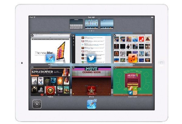
The almost 4-minute YouTube video comes from designer Federico Bianco and shows many great ideas to do with widget integration, media controls, improvements to the lock screen, quick reply, app switching and much, much more. Jailbreakers might already recognize some of the ideas and we think many more iPhone users who don’t jailbreak their iPhones would like to see some of these features.
It’s widely expected that the Apple iPhone 5S may also be introduced at Apple’s WWDC event and if so this is likely to be running iOS 7 out of the box. It will certainly be interesting to see how many of the various iOS 7 concept ideas will come to fruition. Once you’ve taken a look at the video below this story then we’d be interested to hear what you think of Bianco’s concept ideas for iOS 7.
Are any of these imaginings something you’d like to see on the real iOS 7? Have you any ideas of your own that you think would bring a real improvement to iOS 7? Let us know with your comments.

Comments
One thought on “iOS 7 vision shown on video, multi-ideas impress”
LOL at the widgets… those are not widgets those are just quick peeks… A widget is something always on a home screen…. It’s not terrible but the naming scheme of it is laughable at best. Basically it doesn’t launch a full app unless you tell it to for most of these. Kind of defeats the purpose if you need to still scroll through apps and tap something to get a widget…