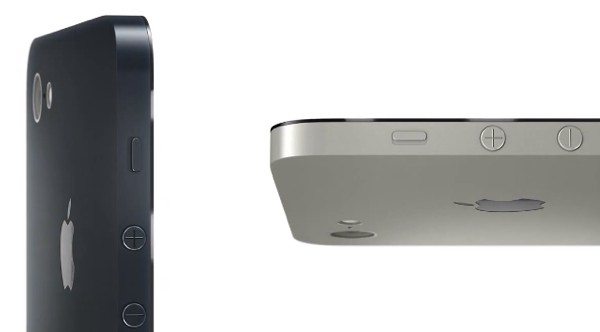
iPhone 6 beautiful design with Apple approach

The Apple iPhone 6 continues to be the subject of much debate but we are still so far away from a release that apart from the odd rumored specification we haven’t a lot to go on just yet. What we can do though is to think about what we want to see and view some designer’s ideas of what they would like the iPhone 6 to look like, so with that in mind we have an interesting video showing a beautiful design envisioned for the iPhone 6.
As we haven’t much concrete to go on for the iPhone 6 we’ve already shown some concept ideas such as this recent look showing an iPhone 6 featuring a touchpad rather than a home button. Today we have an iPhone 6 concept video showing a new slimmer design and once again the aspect that stands out is the lack of a home button.
This rendering came from designer Ran Avni, who previously came up with an iPhone 6 trailer, very much in the style of Apple. The latest video shows an iPhone 6 mockup with a larger 4.5-inch display but slimmer than the current iPhone 5. This rendering is shown in black or aluminum color options.
We think it’s fair to say that this new concept idea shows a stunning looking device but still looks as though it could have come from Apple, that’s great if you like the current iPhone design approach or not so great if you want the real deal to have a groundbreaking new look. You can view the 40-second video below this story.
It’s widely expected that the iPhone 5S will debut this summer after a reveal at Apple’s WWDC along with iOS 7, the next major upgrade to Apple’s mobile operating system. The iPhone 6 though is not expected to release until 2014 and yet as we discussed previously the iPhone 6 is the focus of attention right now, mainly due to many people thinking the 5S will be nothing more than a minor refresh.
We’d really like to hear your thoughts on this latest concept design for the iPhone 6. Would you like the real deal to look like this? Maybe you think Apple needs to take a complete departure from current iPhone styling and have an idea yourself of how you’d like it to look? Are you convinced about an iPhone with no home button? Let us know with your comments.
Via: iClarified

Comments
5 thoughts on “iPhone 6 beautiful design with Apple approach”
This is so gay. I’m sick of buying new Apple products.
Virtually no improvement, rather degradation…
No home button = getting to the homescreen way too many times on accident
Gee I was thinking the same about Android phones. Making a bigger phone is all they got. I don’t want a bigger phone. 6.3″ is ludicrous. I would rather be “sick” of buying Apple phones than”dying” with an Android phone. But, different strokes for different folks.
It’s concept art, you tool. This design did not come from apple. Relax.
It looks great nevertheless.
Wow, it looks good. With the iPhone 6, we could see apple stepping up the size once again.