You’ve identified a need and created an app; now all you’ve got to do is get it to market! If you intend to sell your app you need to ensure that you have a great website design dedicated to your app. We’ll take a quick look at some of the cool iPhone app website designs around and look at some of the common design similarities.
Things to Remember when Designing Your iPhone App Website
Remember these three tips when designing the website for your iPhone app and you’ll be on to a winning design!
Simplicity — One page websites are ideal for iPhone apps. They are simple and easy to navigate. Simplicity works very well for Apple, so it makes sense that it would work well for iPhone App websites.
Illustrations — Minimal text but plenty of images — bear this in mind and you’ll be on to a cracking design. Make sure your iPhone app web design includes screenshots and bold illustrations.
Call to Action — Make this clear, obvious and instantly accessible. Toggle between the default app store button and your own design with some A/B testing to see which generates more clickthroughs.
A Quick Peek at the Coolest iPhone App Website Designs
By looking at some of the coolest iPhone App website designs you can get some inspiration for your own iPhone app web design. Here are some of our favorites:
Analytiks
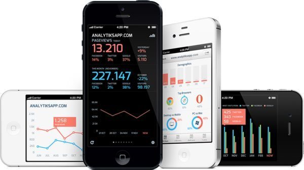
Analtyks is a fab app that has a web design that combines all three of our design tips; simplicity, screenshots and a clear call to action. Given that the app is already graphical, the designers knew it need to be placed on a plain background with simple design features to help the features of the app stand out. A well designed website for an awesome iPhone app.
Ben the Bodyguard
You simply couldn’t write a post about the coolest iPhone app web designs without mentioning the beautifully designed Ben the Bodyguard website. Big, bold black and white headers, with a clear price, a fantastic illustration, a clear call to action (using the standard App Store logo) and only one other link off to play the trailer. Two lines of text eloquently summarize the app’s purpose. This is how you make a fantastic iPhone app web design!
Circle
The chaps behind Circle clearly have a great designer on board because the website is just as well designed as the app itself. Clean, clear and uncluttered, the design utilizes a great screenshot and clear call to action buttons.
DUI Dodger
DUI Dodger is an app to help prevent you driving under the influence, and one peek at the app’s website design makes it clear what the app is for. The design is split almost neatly in half; on the left is a big screenshot of the app (showing the calculation of the blood alcohol levels of the user and two features — call a friend or test again). On the right are two smaller illustrations of a police car and some alcoholic drinks, some sales text and a clear call to action. All in all this is a clean and simple design that instantly conveys the purpose of the app.
Pretty Poo
Pretty Poo is an imaginative iPhone app that uses a very simple colorful design with three clear illustrations to represent the apps purpose. The clever use of color makes this a winner, but the App Store logo seems a little detached from the design. Other than this one flaw this is a great design.
Weave
The Weave app web design is simple and minimal, but its basic design ensures that the eye is drawn to the creatively designed call to action button. The designers have also included Facebook ‘Like’ and Twitter ‘Follow’ buttons helping to sell the product and grow their online audience.
Author Bio: The article is written by Jason Phillips, an experienced writer with a unique writing style. He works for a website offering Crucial Cloud Hosting and web hosting. He loves to video chat with friends as his leisure.
