iOS 7 without skeuomorphism visualized in images & video

In only a few weeks time the world should see what the future holds for the iOS mobile operating system at the WWDC 2013 event, and now iOS 7 without skeuomorphism has been visualized in some images and a video.
The next version of the iOS software has been designed by a team that has been led by Sir Jonathan Ives, and we have already seen a few concept ideas for the software but this latest one we have for you today is going on the previous rumours of the upcoming software.
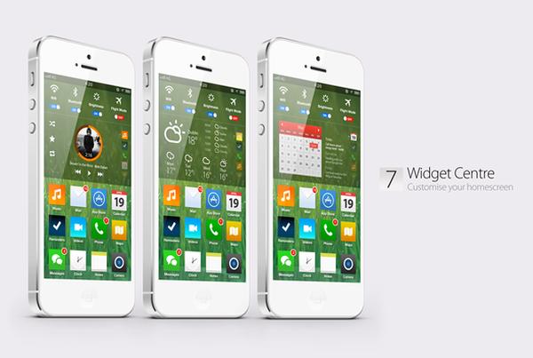
Now Simply Zesty has let their Art Director Phillip Joyce loose on a concept idea for the iOS 7 firmware to provide a complete walkthrough with images and a video that can be seen below. The design brings an elegant but modern feel to the operating system with a completely overhauled idea.
The lockscreen for instance still has the slide to unlock feature but uses up less space and is now placed at the top of the screen so there is room for the likes of Siri, Maps, and the camera at the bottom.
Bundled apps now have a fresh new look and a new Widget Centre creates more freedom for users to customize their home screens, and the colour scheme has been improved with a more vivid look and Siri has been enhanced to provide more integration as well as being smarter.
Take a look at the video below and use the link above to see more images of the iOS 7 concept and tell us what you think of this latest design.

Comments
5 thoughts on “iOS 7 without skeuomorphism visualized in images & video”
Looks like Apple is copying widgets off windows and android…
Now let me get some popcorn quickly…
this concept is really good looking
I’m glad that the creators of the video don’t work for Apple.
It looks great but I do not see this happening on the iPhone because it looks too much like Android and Apple has way too much pride to copy its closest rival…
Apple having too much pride not to copy? Good one.