iPhone 6 specs delight – bigger display, customizable UI & LED notifications

The iPhone 6 expected to be announced after the iPhone 5S seems to be getting more attention lately; this is understandable because the 6 will be the one that outshines the iPhone 5S when it comes to design and specs.
Apple has the world at their feet with so many patents under its belt, and now we want to let you know about the iPhone 6 specs delight that includes a bigger display, customizable UI & LED notifications and much more.
iPhone 6 Concept 1
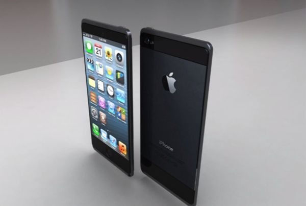
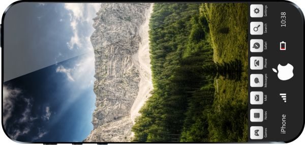
The iPhone 6 concept created by Deviantart user Fishbertus could be a reality, there is nothing on this smartphone that is hard to incorporate. This one has a bigger screen more than likely to be 4.5-inches with an Ultra HD interface. A 4.5-inch display is impressive considering the whole size of the iPhone 6 is the same size as the iPhone 5; this is small but big in a way.

There will be themed apps, the UI is customizable, you will also notice the Home Button is now a Touch button, other features include ability to place apps under the toolbar, interactive wallpapers and animated shots will be great thanks to the 7+ megapixel area wallpapers. The iPhone 6 concept 1 shown above could possibly feature a 13-megapixel camera, edge-to-edge display with 2K resolution, 64 to 128 GB of storage, 8-core Apple CPU, LTE+ and 2GB of RAM.
iPhone 6 Concept 2
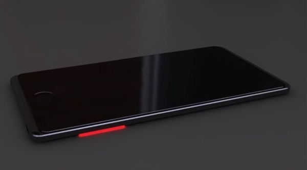
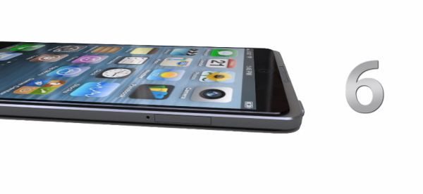
This concept developed by designers Uygar Kaya and Ran Avni looks great, some of the features include LED notifications on the sides of the phone that will light up different colours for different notifications, wireless charging and will come with a larger display.

Look at the images (One above and two below) as well as the YouTube video we have provided below this article.

This iPhone 6 is something we would love to be real, forget pipe dreams Apple, just make it happen and make us all smile. This one is water and dust resistant just like the Sony Xperia Z, it also has a premium feel, full HD retina display, ultra slim design, charging animation, speaker on the front near the Home button, it also includes a 13-megapixel camera, touch-sensitive rocker volume rocker and much more — watch the video (Thanks Redmond Pie)
Do you prefer the iPhone 6 concept 1 or concept 2? We would love to know if you like any of the features mentioned above.

Comments
6 thoughts on “iPhone 6 specs delight – bigger display, customizable UI & LED notifications”
No news here. Sounds like all the features in Amy Android device.
If concept 1 was real, it would be epic. But sadly, it’s safe to assuming that the 5S/6 will be a disappointment with only minor updates… that’s how Apple roll, behind…
Need scratch resistant iphone!
Got to love both designs, A* for all concepts. What I think seems to be the problem is getting these ideas into practice. Concept 1 is obviously the pipe dream and the 5% battery is the nod to reality. I think concept two is definitely more likely with the antenna around the outside and increasing the ratio of screen to front face will be gladly received. What I want to see is if Apple insists on the home button real estate that we utilize the space either side as maybe a track pad? It would even be nice to just have screen and touch sensitive either side, I know it look strange but a blacked out home button on a nice 5 inch screen really wouldn’t be that ugly and ooh possibility of the button being an LCD it’s self. Obviously not going to be good for the home screen unless they come up with a new UI, it can just be blacked out for that but for full photos , games and apps there would be some extra space there which frees up the precious screen. It is definitely time for touch sensitive sides, volume up down, page scrolling with out fingers on screen Touch sensitive buttons for games the possibilities are endless and the sensitivity really wouldn’t need to be that great we want horizontal and vertical scroll I have seen TVs and other hardware that have simple versions add some pretty LED banding and you have an awesome practical look.
I find concept 1 quite nice, apart from the fact that there is no place to put your ear. I see Apple as the company that has always created the wave, not followed it. I truely hope that Apple will continue persueing there own, unique identity in the new phone, and not try to mimic features from other devices. The reason all iOS’s looked the same since day one… Because it works! How many phones afterwards have followed the iPhone’s menu? It was the design of the future, yet simple. Let me not go off topic, all I want to say is that I can’t begin to think or imagine what the new iPhone should look like, but I know it WILL make me as iPhone user proud, and wanting more.
My phone design is better, I cannot however show you any renderings as its only distinguishing feature is that it exists as a fracture in L-Space, and is powered using zero point energy.