Android 5.0 Key Lime Pie concept features that should release

There are no signs of release for the new Android 5.0 Key Lime Pie operating system as of yet, but we do have a concept idea that we believe should release. We love the new Android 5.0 KLP concept by Jinesh Shah.
We talked about this concept idea not so long ago, but wanted to talk a little more about it, call this part 2 if you like. Thanks to many photos posted on Google+ we get a great idea of what Android Key Lime Pie should look like, some may like it and a few may not, but we think it looks sleek and exciting.

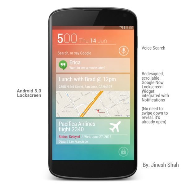
The designs and renders of the new KLP 5.0 shows many features that includes a new UI as well as multitasking and dialer and much more. We have added a few pictures here, but if you visit Google+ above you will see many more. They show Voice Search, redesigned scrollable Google Now lockscreen widget with integrated with notifications, which means there is no need to swipe down to open notifications.
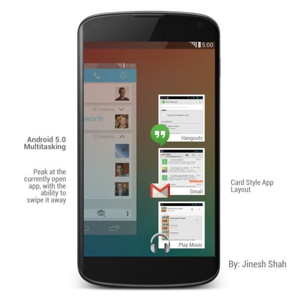
The new concept features a new transparent task bar as well as overlapping widgets and multitasking has changed for the better, this will allow apps to be looked that are currently open as well as swiping it away.

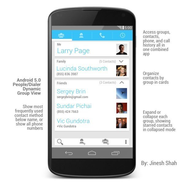
The photos also show a new ‘People and Dialer’ feature in a card style format, it offers voice dial and search to call people directly. You will get to see card-based contacts as well as dynamic group view, the features look great and with the option to expand or collapse each group looks promising, showing shared contacts in collapsed mode.
You can swipe over the screen for call history, as well as redesigned clock widget, pull down fully to reveal widget, so far this sounds very nice indeed.
Please let us know what you think of the new Android 5.0 Key Lime Pie concept features?

Comments
2 thoughts on “Android 5.0 Key Lime Pie concept features that should release”
Android 5.0….the Key Lime Pie, has started to show case:
The future of android tablets looks bleak. Everything looks just like a giant phone.