AT&T Nokia Lumia 1020 (EOS) in ugly vs pretty

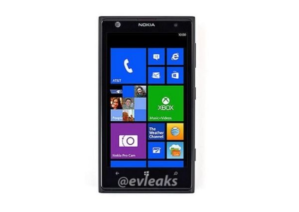
The debates will be high on the new AT&T Nokia Lumia 1020 Windows Phone aka EOS, at the moment all we have to go on is a leaked photo rendering of this new smartphone.
Nokia will be holding its press event on July 11, which is only 7 days away and no doubt the Lumia 1020 will make an appearance, that’s the hope anyway.
The Nokia Lumia 1020, which holds the codename EOS could come featuring a 41-megaxpiel camera, what is interesting is the photo via @evleaks via Twitter (Shown Below). The photo shows the phone off with the AT&T logo as well as the new ‘Nokia Pro Cam’ app, we will talk more about this soon.
Nokia Lumia 1020 for AT&T, 2013 pic.twitter.com/oo92M4VtwU
— @evleaks (@evleaks) July 4, 2013
The photo does not really show that much in the way of what materials are being used, will it be plastic or will it be metal? Time will tell, we would prefer a metal chassis rather than the normal polycarbonate.
We reported a few days back about the Nokia EOS having an aluminum body going into production, you may want to read this because it shows leaked images of the design, looks a lot better than the image we have here.
Nokia Lumia 1020 in Ugly vs Pretty
Hopefully the @evleaks photos shown here are for illustration purposes only to show of the camera app and AT&T logo, if this was to be the final design then sorry we would have to put this in the innovative bin.
Windows Phones according to many smartphone owners say that Windows Phones are not what you call great when it comes to design they all look rather similar. Do you think Windows Phone smartphones are ugly or pretty?
The Nokia 1020 (EOS) is said to come with an OLED display but size is not known, possible 32GB of internal storage, this is all we have for now. More information will come soon, so stay with Phones Review for notification.

Comments
2 thoughts on “AT&T Nokia Lumia 1020 (EOS) in ugly vs pretty”
I would rather it be aluminum as well. However, to call the design of the 920 ugly is getting carried away. The 920 has won countless design awards. Most recently it won GOLD at the IDEA, International Design Excellence Awards. So, one could conclude that many people like that particular design. With that being said, it would seem not only logical, but very smart for Nokia to differentiate their shiny new innovative wonder in a new material than in a retread design. Come on Nokia, don’t cut corners! What say you?
This Article is written by an anonyous Android Dart Vader from the Dark Site so dont take it serious.