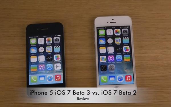
Since Apple first showcased its new upcoming mobile operating system to the world we have been bringing you all the news about the new features and its performance, and how it stacks up against other operating systems on various devices. Today we are looking at the iPhone 5 iOS 7 beta 3 vs beta 2 that is reviewed in a couple of videos.
The iOS 7 beta 3 went live only yesterday and we now have a video for you comparing the last two betas that have been released to developers. The first video below is comparing the beta 2 and beta 3 releases of iOS 7, and looks largely the same before you start going more into the software.
It soon becomes apparent though that if you go onto the lock screen the battery logo is slightly bigger when compared to the home screen, which isn’t available in beta 2. Airdrop and Airplay have been improved especially when sharing content with AppleTV.
Some other changes are demonstrated for iCloud and Siri now has different voices, while folders are more transparent when compared with beta 2. The Calendar now has a little dot on the date of an event you may have planned, and the clock icon has now been changed slightly.
Music playback on the new beta 3 now shows a timer on the lockscreen for the track that is playing, and when downloading a new app it looks a little different than before, with the icon slowly appearing on the homescreen as it downloads.
There are a number of other differences that are shown in the video that is just under 11 minutes long, and below that is another video that is just over 8 minutes long that just concentrates on iOS 7 beta 3.
