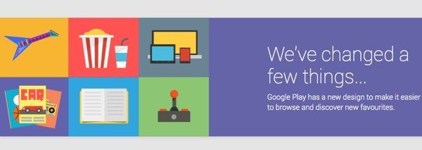
Some readers may have been waiting for the new-look Google Play Store that we first heard of in May at Google I/O. On an initial look we think there is plenty to be pleased about, and we’ll give you a few details about some of the changes. What we’d really like to know though is your views on the Google Play Store revamp, as we’ve also noticed a couple of issues.
The new design for the Google Play Store is now live and echoes the look of the existing Google Play 4.0+ Android app with a card-style layout. Google feels the revamp will make it easier for users to find new favorites and browse, but we often find that there is some resistance to change, at least in the early stages, so it would be interesting to gauge opinion.
One of the significant improvements with the new Google Play Store is that it will adjust itself to suit the screen size of a user’s device. Navigation is certainly clear enough, simply look to the top left corner to see various tabs for Apps, Music, Books, Devices and more, and below these you’ll find My Wishlist and options to redeem or purchase gift cards.
One click takes you to the required section so that for example, if you click on Apps, this then shows tabs including My Apps, Shop, Games and Editor’s Choice. If you hover over the white arrow that you’ll see below the tabs you’ll be able to quickly head to another category.
When you take a look at individual app pages you’ll immediately be able to see big changes in the layout, with nicely sized images. The app description stretches across the top of the page, followed by a reviews section, and then What’s New, all on the same page. At the bottom you’ll find additional information such as compatibility requirements.
Of course it will take time to have a really good look through all of the aspects of the new Google Play, but our first impressions were positive. However, from what we can see it doesn’t appear possible to uninstall apps from the web, that’s unless we’re missing something. Another thing that seems to be lacking is the ability to see which apps are installed on particular devices, and we could find other omissions yet.
This is why we’d really like to hear your views on the revamp of the Google Play Store. Do you generally like the new design and think it’s a refreshing change? Maybe as well as the omissions we’ve mentioned above, you’ve also noticed other issues that are frustrating you? Let us know with your comments.
Source: Google Play
