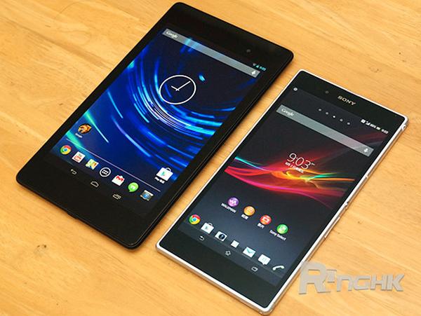
Over the last couple of years we have seen smartphones and tablet PC devices getting closer together in terms of screen size and features. This was kicked off by Samsung back in 2011 with the launch of the original Galaxy Note that led to more companies offering phablet devices, and today we have the Nexus 7 2013 and the Sony Xperia Z Ultra in a side-by-side look.
We are not actually comparing the two devices but instead have the two devices next to each other to demonstrate how similar in size they now are. The Sony Xperia Z Ultra features a huge 6.44-inch Full HD touchscreen display that isn’t much smaller than the Full HD 7-inch screen that comes on the new Nexus 7.
The Nexus 7 2 made its debut last month with the company making the device slimmer and lighter than last year’s model, and this was achieved besides the device now having a Full HD display with the more powerful Qualcomm 1.5GHz quad core Snapdragon processor and paired with 2GB of RAM while running the new Android 4.3 Jelly Bean operating system.
Sony’s new Xperia Z Ultra is pushing smartphones ever closer to the tablet market though and it also offers support for a stylus, but the rather square design will make the device bulky in the hand and may look rather silly to some when held to the ear when making a call.
It will be getting to the stage though when some users won’t see the need to owning a tablet as well as a smartphone when the likes of the Z Ultra and the soon to be announced Samsung Galaxy Note 3 has the features of a tablet, but can also make phone calls.
Do you think the Sony Xperia Z Ultra looks more like a tablet?
Source: RingHK via Google Translate.
