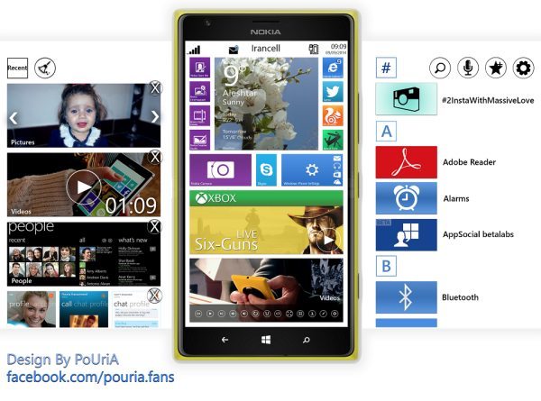
Nokia Lumia 1520 running debatable Windows Phone 9

Some may love this and a few may not, take a little look at the Nokia Lumia 1520 running the new Windows Phone 9 concept.
The Windows Phone 9 operating system concept is the creating of WPcentral forums user PoUria, to be fair it all looks clean with a few things that stick out that makes it fundamentals look clean.
If you look at the image below you will see WP9 on the Nokia Lumia 1520, and even though the tiles are separated nicely and the whole layout just looks rather nice, but that is our opinion, which some will not agree on.
The tiles look more dynamic and more information now shows up, like the little images that show what is happening behind the tile.
One WP Central member said that it is a privilege to break the designers heart but it looks awful, they say that the Windows Phone 9 does not follow the modern UI lines, it looks cluttered and that no one would use so many buttons on the music tile, the member also goes on to say that the app list is great as it already is.
This is why we say some will love this Windows Phone 9 concept running on the Nokia Lumia 1520, but some will not.
Do you like this WP9 concept?

Comments
5 thoughts on “Nokia Lumia 1520 running debatable Windows Phone 9”
I’ve been and remain an Android fan – I still own the original Note, but I’m due an upgrade and the Lumia 1520 has got my attention for all the right reasons. No operating system is perfect and I’m sure WP has its flaws, but this appears to be a quality product and it deserves more than just a superficial glance, as offered above.
I love it. I have been an iphone user for a while and i tried android. i really dont care too much about thousands of apps. i need quality apps, the most i will be using is aroudn twenty apps. i really love this phone. I just cant imagine 1520 with this concept. It would be awsome. windows os is very smooth and attractive. Nokia is beatiful.
Yes it is SUPER!!!
I am a graphic designer. WP is much nicer and cooler then Apple!!
It looks nice but some things don’t match up too well, e.g. the skype tile looks too small like it has been squeezed in there. I also agree with the user who said the app list is great already. This new looks just seems..just not nice. I guess the tiles look better as squares than rectangles in the app list.
I do think we should be able to have a bit more freedom when it comes to the tiles on the start section but the app list should stay as it is. A notification section would be fine and the current methond of seeing what Apps are open are fine as it is.
Ugly…