Windows Phone 9 design vs Primus Ubuntu Touch

The world of concepts always has us all on the edge of our seats; it is a way of showing us what is possible. Two fantastic designers called Ghani Pradita and Naveen Kumarasinghe have designed two new smartphones called the Windows Phone 9 and the Primus Ubuntu Touch respective.
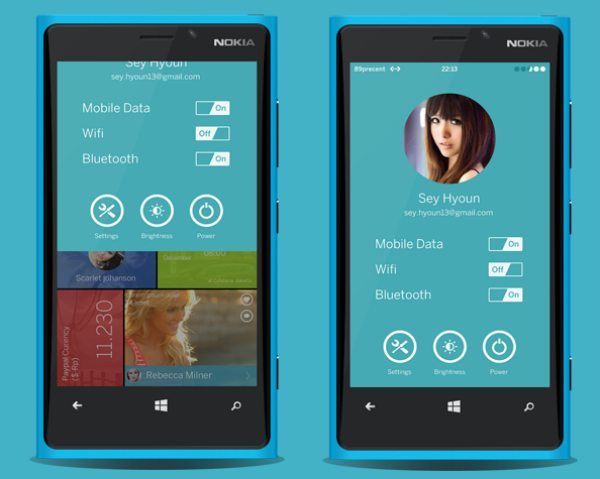
Ghani Pradita created the Windows Phone 9 smartphone render, and his creation is being shown over on Behance and this time round it channels mainly on UX, UI accessibility and notifications and the way it looks.
The creator says that the widgets are scrollable horizontally; he also shows you the panel shortcut and new lockscreen. There is not great detail with the Windows Phone 9, which means the photos will have to do for now. It maybe ok to have scrollable horizontally like Window 8 desktop version but for me it looks a little too cluttered.

However, the Windows Phone 9 design looks very nice indeed, simple lines and no more to throw you off the classy look.
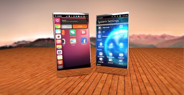
The next smartphone concept is by Naveen Kumarasinghe via Google Plus; this handset is called the Primus with Ubuntu touch.
The Primus Ubuntu touch has its good and bad points; it offers both glass and metal that could potentially provide the transparent phone we all want. It comes with an edge-to-edge display, and looking at the rendering it looks a little stumpy.
There are no specs, but judging on the photo the Primus Ubuntu touch smartphone would have a 4.7-inch display, there is something futuristic about the phone, it has that look about it that you want to hate but you just love. If you look at the user interface you can see the accessible panel on the left, which looks stunning and simple, a very good idea for opening apps with ease.
So given the choice out of the Windows Phone 9 and the Primus Ubuntu Touch, what design do you prefer the most?

Comments
7 thoughts on “Windows Phone 9 design vs Primus Ubuntu Touch”
Prefer the Ubuntu Phone.
ubuntu
No challenge. UBUNTU!
Ubuntu! Really, that phone is so beautiful Microsoft never had a chance!
Ubuntu phone looks amazing!
totally ubuntu why cant you’ll produce the ubuntu phone instead of that stupid microsoft thingy i will totally buy it you’ll get good profits
ubuntu, but I hate the ugly gradient button (the orange one) 🙁