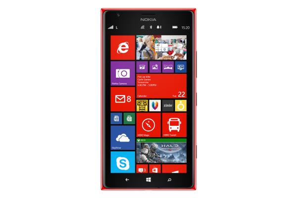
While Nokia last year enjoyed some success sales wise for its lower end smartphones the latter part of 2013 saw the release of the company’s first phablet sized devices. The Nokia Lumia 1520 is currently the platforms flagship device and today we have a video review of the device for you, which is being called a step in the right direction.
The device was officially launched in India towards the end of 2013 and below this article we have a video review of the handset for you that is just over nine minutes long. The video kicks off by running through the firsts for the platform with the device that includes the quad core processor and the first phablet with a Full HD touchscreen display.
We get a full run down of the handsets specifications with a look of the Lumia 1520’s design that just looks like the rest of the Lumia family. The reviewer feels the look of the handset makes it feel well designed and appealing, and we get to see where the various controls and ports are positioned.
The display is talked about with its slightly curved edges before we get a full look at the whole device, and the reviewer likes the build quality of the handset. The curved edges make the handset a little easier to hold, and if you want a larger sized handset the Nokia Lumia 1520 is well worth considering.
It was felt that the display on the handset was one of the best seen recently with good colour reproduction, which can also be said about the contrast and viewing angles. In use the processor easily deals with anything that is thrown at it, and the main rear facing camera also comes in for some praise.
We get to see some images and the benefits of the pre-installed Nokia Black update, but there is a lack of high quality games currently available for the device. The handsets battery life was found to be excellent and the device is labelled a step in the right direction for Nokia and Microsoft.
Check out the full video and tell us what you think of the Nokia Lumia 1520.
