Samsung Galaxy O design feels retro

One thing that we see mentioned time and time again is that while readers generally love Samsung Galaxy smartphones, many would like to see Samsung come up with something new in the way of styling. Today we have a Samsung Galaxy O design to show you, but we can’t help feeling that his handset feels a bit retro.
We should point out that this Samsung Galaxy O creation is a concept design, but we do enjoy looking at concepts from time to time as they can offer us some teasers and ideas for how new devices could look. Although we’re not particularly struck on the Galaxy O design it does at least look different from the Galaxy phone designs we’ve seen lately from Samsung, so we thought some readers might be interested in seeing this.
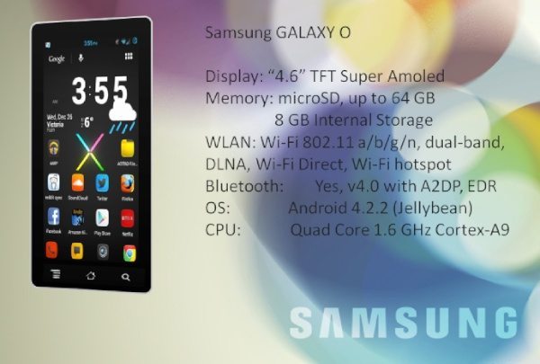
This render comes from designers Mobogenie and rather than the usual high-end or even futuristic specs we see on most concepts, this one seems more like a mid-range smartphone. Included specs are a 1.6GHz Cortex A9 quad-core processor, 4.6-inch Super AMOLED display, and 8GB of internal storage (expandable via microSD to 64GB).
Further specs of the Samsung Galaxy O are Wi-Fi 802.11 a/b/g/n, Wi-Fi dual band, Wi-Fi Direct, Wi-Fi Hotspot, Bluetooth 4.0 and DLNA and it runs the Android 4.2.2 Jelly Bean operating system. Capacitive buttons are shown beneath the display along with apps including Amazon, Netflix, Astro File Manager and Firefox, that we usually wouldn’t expect to see.
You might also be interested in a recent Samsung Galaxy S5 concept design that we shared. Although the form factor of this Samsung Galaxy O handset appears to be very slim, we’re not too sure at all about the overall appeal of this concept phone. Therefore we would be interested to hear what you think, as opinions can vary so much.
Do you admire this concept Samsung Galaxy O, or maybe you feel the idea is a little dated? Let us know by sending us your comments.

Live Comment
Your email address will not be published.