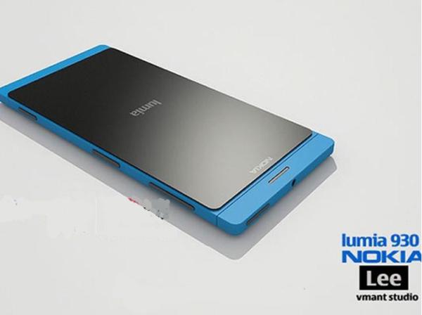
Nokia Lumia 930 design is impressive

The Nokia Lumia range of handsets has slowly been increasing with some worthy handsets added to the line up, and there has been one handset in the last few weeks hitting the headlines that has made a lot of people to sit up and take notice. The Nokia Lumia 930 design that we have for you today is impressive.
It is thought that the Nokia Lumia 930 could be the global version of the Verizon Wireless Nokia Lumia Icon, which is believed to be showcased at an event on April 19th. It has been rumoured the device will have a slightly smaller display at 4.5-inches, but still powered by a quad core 2.2Ghz processor with 2GB of RAM.
There is also thought to be 16GB of storage expandable via microSD card, and this image that you can see on this page is a concept phone of the Nokia Lumia 930, which has been created by the Vmant Studio.
The device has also been known as the Nokia Martini but until the event next month we won’t know the full specifications of the Nokia Lumia 930.
Would you buy the Nokia Lumia 930 if it looked like this?
Source: nok4us via Concept Phones.

Comments
4 thoughts on “Nokia Lumia 930 design is impressive”
It looks great but it’s still no HTC One.. also it has that stupid windows software… which I actually wanna try out one day.. but I am gonna buy a cheap ass phone to do that… not a top of the line one…
Looks good. Can’t wait 8.1 . if the 930 is like 920 , only better, I will be snapping it up
wp8.1 is going launch April 1/2 week.
It’s nice and flat and I like how the screen appears to be lying on top of the device, but I don’t like the blue edges sticking out at the top and the bottom.
But I think I’d get it anyway, I care most about the specs and the OS and I don’t dislike it enough to not buy it ;o)