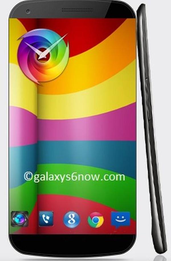
Samsung Galaxy S6 design doesn’t inspire

This year’s handset may have only recently been released to the public but we are already beginning to hear rumours and see various concepts appear for the Samsung Galaxy S6, but the design we have you today doesn’t inspire much.
We have already seen some Galaxy S6 concepts with one even having an asking price, but the one you can see on this page comes courtesy of galaxys6now, and the design is using the Youm technology that has been pegged to arrive this year for the Galaxy Note 4 as well as for next year’s flagships.
This design has a 5.5-inch screen with the latest version of the Qualcomm Snapdragon processor under the hood with 4GB of RAM, and running either Android 5.0 or 6.0. On the back there is either a 16MP or 18MP camera while the handset would probably be made out of aluminium.
There is waterproofing for the display while the handset offers 5G connectivity with internal storage coming in 64GB or 128GB options, and a battery of between 4,000 and 5,000 mAh provided.
Do you like this design?
Source: Concept Phones.

Comments
13 thoughts on “Samsung Galaxy S6 design doesn’t inspire”
Samsung galaxy device design sucks!!! I am not interested with this device. HTC is more interesting it has more premium design than any other smartphone around.
I got the s5 and I love it. And the devices I had before where great to… so not sure how you come to that. And if it truly sucked people would not buy it
you couldn’t be more wrong.
“and if it truly sucked people would not buy it.”
If you look at EA’s success, that’s just not true. EA themselves suck, Origin sucks, and a vast majority of their games are buggy. *cough* sims 3, Battlefield 4 *cough*
People buy whatever they think is mainstream. Which is why Apple’s marketshare will ‘start’ to plummet, and Windows Phone will boom in the next 4 years.
That’s right.
I predicted Blackberry’s downfall in 2007
Your dumb. Galaxy is one of the BEST PHONES AROUND!! I absolutely LOVE my galaxy s5!
Yes right it is a great device!
however the design looks ugly
sorry, Dominique I don’t have any dumb. Nor did I say it was a bad phone.
I tell you, teenage girls hear and read what they want to hear.
You can say that now but that does not mean you are really saying that… That way i can say i knew that the world war would happen without even being born… Very easy to say after… And 2007 the downfall was not that not close… So you saying it way ahead of time… And next to that many people already knew that it would not stay well in the market…
And next to that it is still a opinion about the Samsung device. because i love and you cant say that i am wrong in that because i just do… I wish you goodluck though with hating some phone. Htc lover
I love Samsung. You read what you wanted to read.
And if you can find the online forums from back then, it’s documented. Don’t blame me for lack of effort on your part.
Ok then you just don’t like this concept? I mean in design i always loved Samsung. Sure there not the world best but i truly like the design. Because cool is fun for a moment. Just like using wierd colors that are cool at first. But later on it gets boring and gets ugly. In my eyes a more simple style looks better because it does not get boring.
I own the original galaxy note full HD amoled screen its nearly 3 years old now. I need to upgrade i was interested in the htc m8 but no battery back up also checked out sony z2 Mmmm nice but no battery back up! i feel the note 3 is just geting a little to big, personally its the the best phone out there bar none! its a beast. But the s5 is the one im going to buy! it covers all areas well! as for the plastic back i need to change batteries with ease, besides there cheap online. And i throw a cover on all my phones so i want see the back! i checked it out in store. Google now opens up on front screen when you say ok google bit like the moto x.
we can all agree that galaxy s5 is best phone stuck inside the fugliest cheap pos design. sorry but Samsung doesn’t have a clue about premium quality and the don’t need to because average consumer doesn’t have a clue about premium quality either
thats one of the most ugliest designs i ever saw