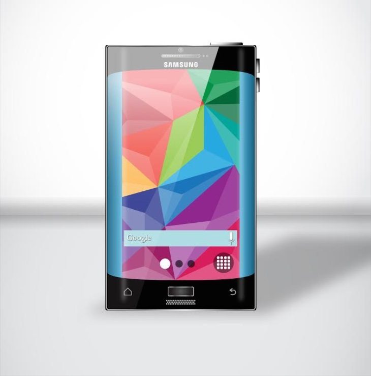
At particular points in the smartphone year there are times when we’re waiting for new devices to write about, and the lull at Christmas and the New Year is a good example of this. In the meantime we can take the time to check out concept ideas to tantalize us for future prospects, but we have to say this latest Samsung Galaxy S6 design fails to impress.
The Galaxy S6 is expected to release around spring, so it could be made official over the next few months. We’ve already seen plenty of impressive design concepts for this highly-anticipated upcoming flagship smartphone (examples here and here), and we often think that many people would like to see the real deal look like some of these visions. However, the image below shows a Galaxy S6 render that we feel would be a complete non-starter among Android enthusiasts looking forward to the device.
This concept is billed as a “wider, tougher and better Galaxy S6,” but although it’s undoubtedly wider we’re not of the opinion that it’s better, although you may disagree! This idea features double stereo speakers (better and louder) and is bent at both long edges. It’s also described as being waterproof, shockproof and dustproof.
We have to agree with Concept Phones who came across this concept S6 and described it as #NotMyGalaxyS6. They point to the speaker directly below the home button as just one example of why this is a bad design, and the large round volume buttons as another.
To us the concept is too squat and just looks plain odd, and it’s certainly not a handset that looks anything like what we’d like to see when the genuine article is unveiled. However, there may be some people who feel they’re looking at their dream phone… in which case, wake up! Give us your thoughts on this concept Samsung Galaxy S6 by dropping us your comments in the box below.
Source: Galaxys6now.com
Via: Concept Phones
