Motorola EDGE design is a beautiful thing

Very often when we share concept designs they are ideas of upcoming smartphones. However, sometimes one comes along that is interesting enough to show, even if a real version is not on the way. The Motorola EDGE phone design that we have for you today is one such example, as it combines nostalgia with modernity to offer something stunning.
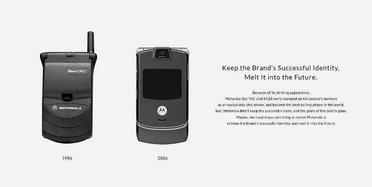
Many readers will remember the distinctive styling of the hugely popular Motorola RAZR and StarTAC, and designer Seungwoo Kim has taken these as inspiration for his Motorola EDGE smartphone. He has focused attention on reviving Motorola’s identity by bringing it up to date for a future look that he hopes would be just as iconic.
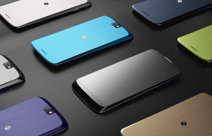
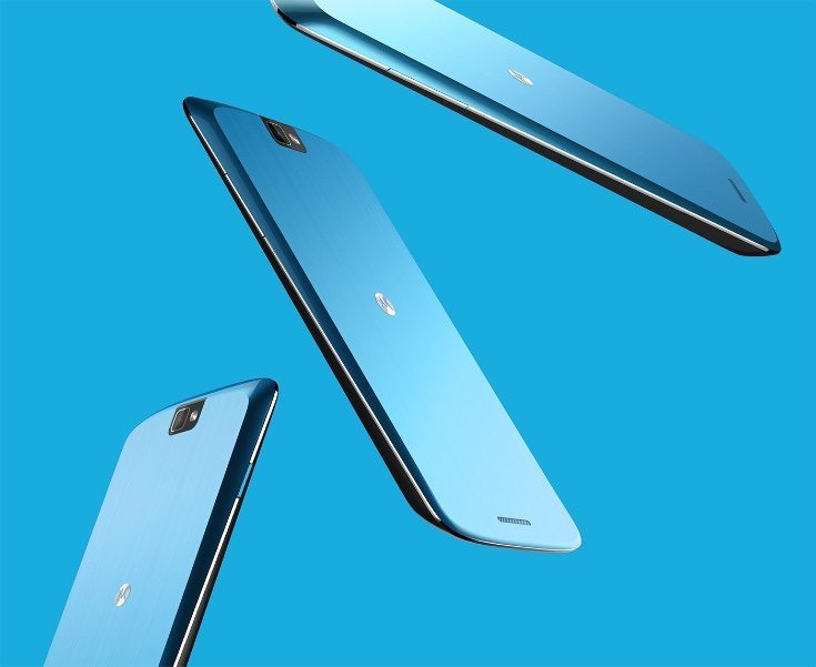
In more recent times Motorola seems to have lost its way a little as far as design goes, but this Motorola EDGE idea would go a long way to making them desirable again. It has sleek lines and a polished chromium rim to highlight the shine. This handset features an aluminum material on the reverse and a two-tone color vision to reflect a more dynamic design for a current day phone.


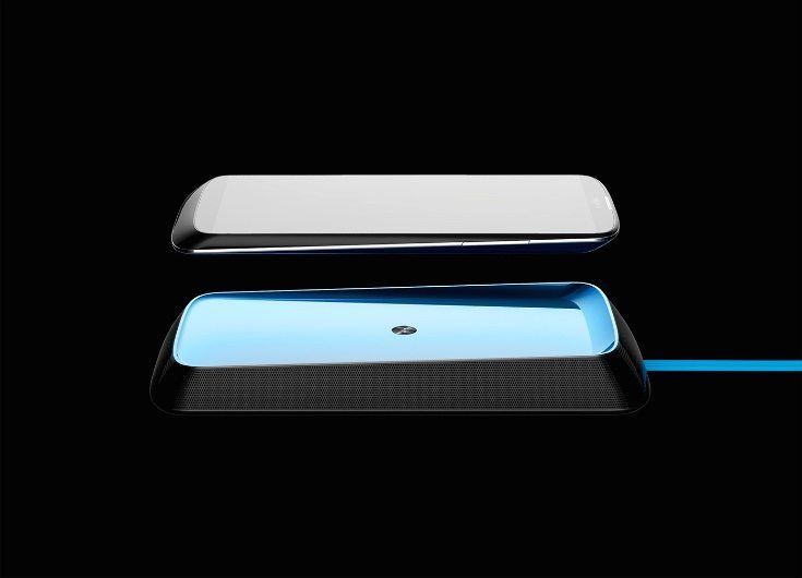
The Motorola EDGE concept lacks a charging port but comes with a wireless charging station that has a unified design. This can also be used as a speaker, playing high-quality sound output from the phone. From the images we can also see some interesting and elegant lines and an edge-to-edge display. We’ve shown a few of the images here but you can see more at the source link.
We feel that this slim, sophisticated and elegant handset is a beautiful thing, and something that many people would love to see for a new cutting-edge Motorola phone. Do you agree? Send us your comments on this concept Motorola EDGE design.
Source: Seungwoo Kim (Behance)
Via: Concept Phones

Comments
One thought on “Motorola EDGE design is a beautiful thing”
Form over function