New Microsoft Lumia 950 concept with edge-to-edge approach

While the world is still waiting for Microsoft to launch a new flagship Lumia, we have to satisfy our cravings by taking a look at the many concept ideas on offer. Today we have a new Microsoft Lumia 950 concept to show, and we wonder if this reflects what you’d like to see for a new high-end Lumia smartphone.
There has been a plethora of leaks about new top-flight Microsoft Lumia handsets sporting Lumia 940 and Lumia 940 XL names, and also Lumia 950 and Lumia 950 XL titles. However, until Microsoft chooses to announce the new upcoming flagships nothing is set in stone. In the meantime there have been numerous renders of new Lumias over the last few weeks and months.
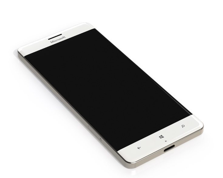
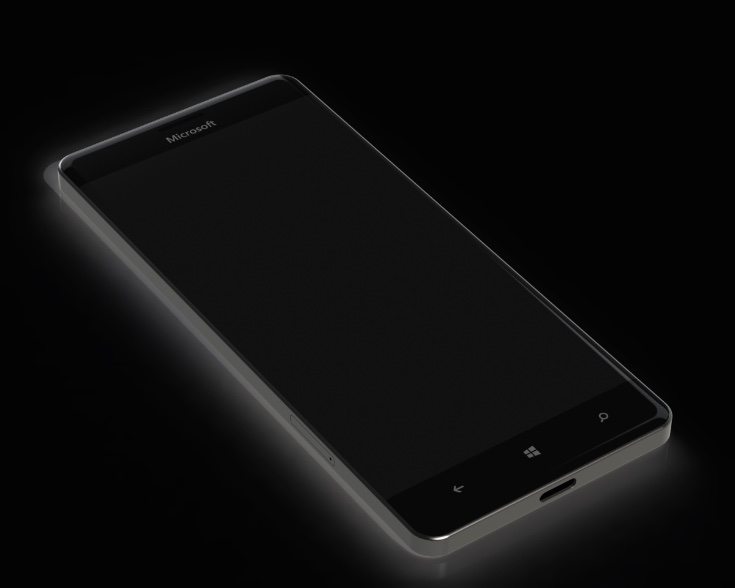
This latest Microsoft Lumia 950 concept was designed by Crowtor although we don’t get to see what the display looks like turned on. It looks as though it has a metal frame although we can’t be sure from the images. There are slightly rounded corners and on the front you can see capacitive Windows buttons. It has a Quad HD resolution display, and the panel looks edge-to-edge with some curvature on the sides. Below the Home button is the microphone.


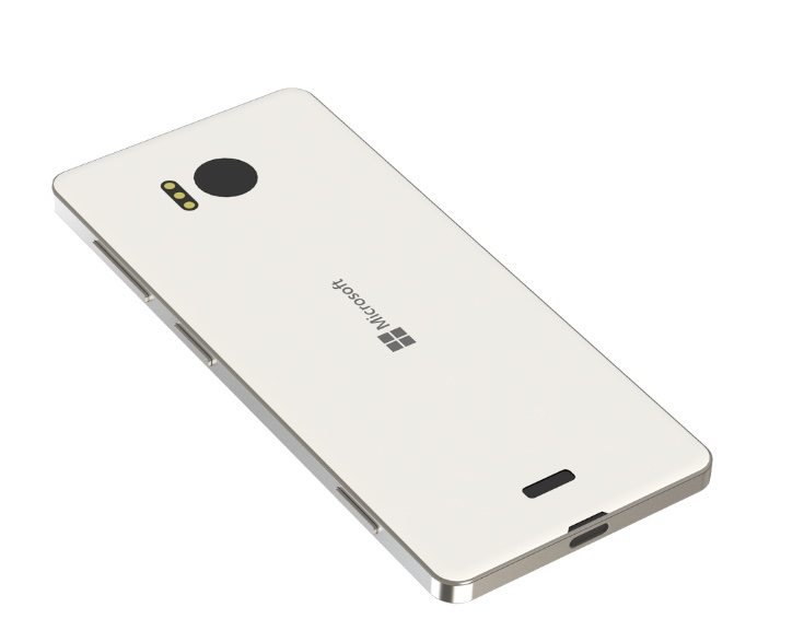
On the reverse there’s clearly triple LED flash for the camera, the Microsoft branding, and a speaker, while at the bottom of the handset there’s a USB type C port. On the side there’s a dedicated camera button and the renders show the handset in black or white colors. This vision has a removable polycarbonate rear shell, removable battery, and is nicely slim at just 6mm thick.
Just a couple of days ago we showed another Microsoft Lumia 950 concept that was well received. You might like to check that out here and see how it compares with this latest design. We always welcome comments from readers so why not let us know your thoughts on this new Microsoft Lumia 950 concept idea using the box below.
Source: Concept Phones

Comments
8 thoughts on “New Microsoft Lumia 950 concept with edge-to-edge approach”
Not thrilled at all with it. If I wanted a phone that looked like an I-phone, I would buy one. This looks like an I-phone 4 (old an outdated).
An alleged leaked shot of a pre-production 940/950 already came out the other day and if it’s accurate, I wouldn’t hold my breathe for anything radically different from existing Lumias. That would be very unfortunate as the existing Lumia design while good, is also now very long in the tooth at this point.
Agree! At least update it. They are getting boring and this isn’t good for win 10 launch device. This one looks OK to me, although a bit iPhone-ish.
My 930 recently started overheating badly and I really hoped I could wait for the 950xl to come out, I will probably still get one but I needed a cheapish phone until they are announced so I bought a 640XL and I have to say how impressed with it I am, I really thought that I would miss the 930 but the 640XL running the latest Windows Mobile build is a damn good phone for the money, it even has a micro SD slot! and a great battery!
It doesn’t really matter as they’ve been talking about a new phone for years and all they keep putting out are cheap pieces of crap that makes them look bad.
They have taken a while to release another flagship, but if you think they won’t put out a good “iPhone killer” to go with Win10 then you’re very mistaken. Microsoft would have to be the dumbest company in the world to make that kind of mistake (granted, they have certainly made some blunders before, but they’ve learned pretty well from those mistakes).
its only one persons view of what it might look like. Personally I really like the new blackberry silver edition
While the “traditional” Lumia design currently used does at least look different from an iPhone, that design is starting to get old. Personally, I think the black version of this concept design, with the sharp-looking metal chassis while still having rounded corners/edges looks like the best design idea yet. Yeah, it looks a little like an iPhone (especially the white version), but with the emblazoned Microsoft name and Windows logo, and if they release it in multiple colors as they have in the past, then it will distinguish itself nicely. Plus, it has capacitive touch buttons (rather than on-screen buttons), and I like that it doesn’t have the camera “bulge” of other designs…I never liked that, it felt weird.