HTC One Aero design shows what One A9 could have been

The HTC One A9 was finally made official in the week and is going to release in November. After months of leaks and rumors about the smartphone there was a lot of attention drawn towards the fact that it looks very iPhone-like. Some readers may know that this device was originally rumored as the HTC Aero, and now this HTC One Aero design shows what the One A9 could have been.
The One A9 announcement was hotly anticipated, but when the phone was first heard of and dubbed the Aero it was thought it would be a flagship smartphone. In truth it sits somewhere between a mid-range and high-end handset as far as specs are concerned, so whether it will be enough to revive the HTC brand is questionable at this stage.
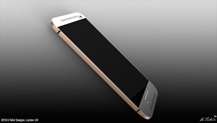
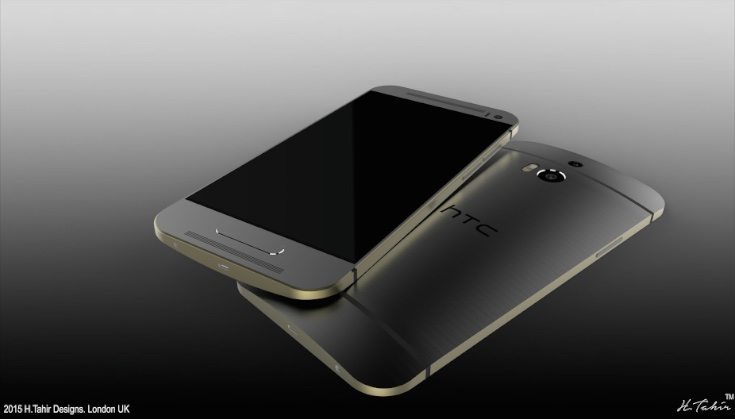
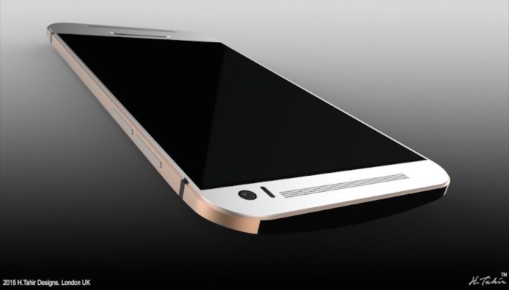
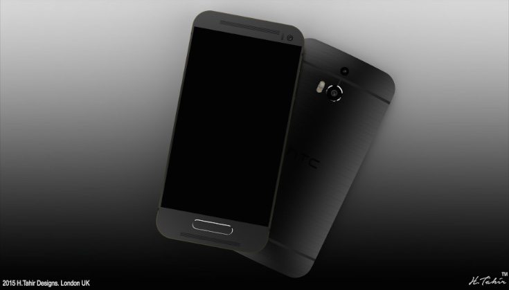
Although the phone has a premium build quality, not everyone was happy with the way the One A9 looked at its unveiling. That’s where the work of Hass. T comes in, as this concept designer has created an idea of how he would have liked the phone to look. It’s called the HTC One Aero and is based on HTC design language from both past and present, but still bringing the latest features.


We think this concept HTC One Aero design is a sophisticated looking handset and it’s shown in Gunmetal Grey on Gold or Champagne Gold on Silver color choices. The designer has removed what is described as the “biggest design flaw” of current HTC One phones, namely the black bar on the front bearing the HTC logo. Instead there is an HTC logo on the reverse and a fingerprint sensor incorporated into the Home button on the front, although it does look a little large.
The designer describes this idea as a mix of phones such as the HTC One M7, M8, M8s, and M9 Plus. For instance the camera on the front right of the phone and long speaker grills are similar to the One M7, while the basic look and measurements are based on the One M8 and M8S. Meanwhile the One M9 Plus inspires the fingerprint and camera lenses of this HTC One Aero design.

While the appearance may be a mash-up of previous One designs, this HTC One Aero is imagined as having the latest specs and features. These include an AMOLED display, optical image stabilization, a secondary camera lens for capturing depth, and USB Type-C connector with quick charging. It would also be running the Android Marshmallow OS.
If you enjoyed looking at this design you might like to check out some more from the same designer, such as this Samsung Galaxy Alpha 2 idea or this Samsung Galaxy Pro. We’re interested to find out what readers think about this new HTC One Aero design. Would you have preferred the HTC One A9 to look more like this idea?
Source: Hass T. (Google+)
Via: Concept Phones

Comments
3 thoughts on “HTC One Aero design shows what One A9 could have been”
Just move the dam finger print scanner to the back and lose the black bar…. WIN!
You know every one was upset last year when the M8 shared the same look as the M7 then the M9 again close the the same, these drawings look like a slightly modified version of the M7 so every one would have been upset with this version as well. I like the new design even though it is simmular to the iphone design i think it still one ups them, look close at the attention to detail all the way down to the part we take for granted the buttons. I say this is another step in the right direction for HTC.
No this is terrible, just cuz he can use Illustrator doesn’t mean it’s good. It’s exactly the M9 but very amateur with the super sharp corners. This only has the cam from M8 the rest is 9,100%. Not impressed…that’s it, gonna design my own HTC. Lol