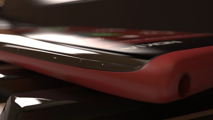
Many of our readers are interested in Lumia smartphones, so it’s always good to look at new ideas when they come along. Today we’re showing a concept Nokia Lumia 767 design that takes some inspiration for its styling from the Nokia 7610 that released more than a decade ago.
Many smartphone concepts that we cover show ideas for known handsets that may be on the way. Others however, show us a prospect of something new that’s not actually in the pipeline seeing as Microsoft has now taken over the Lumia name. That’s the case with the Nokia Lumia 767 design that you can see in these images that come from designer Ihar Novik.
It’s a very sophisticated design that would certainly make your phone stand out in a crowd, but might not be realistic for real-world use. While there are some straight edges the handset has curves at the top and bottom that are taken in opposite directions and create something a little like a teardrop shape. As you can see it carries Nokia branding rather than being a Microsoft Lumia.
In fact the overall shape reminds us of a previous concept we shared for a Samsung Curve phone. The long edges are also curved so the whole phone looks very slick. Obviously this Nokia Lumia 767 is much slimmer than the Nokia 7610, which is shown in the second image above for comparison. Thankfully the newer 767 idea goes without the oddly shaped buttons of the 7610.
The Lumia 767 Windows handset also has some attractive style accents on the reverse that cut through the camera area. It looks as though it has a mainly polycarbonate build but as Concept Phones points out, the back would perhaps lend itself to a leather finish to contrast nicely with the curved glass edges.
It would be extremely interesting to find out what readers think about this Nokia Lumia 767 design concept. If Microsoft were to produce something like this would you be tempted to buy it? Maybe you think it’s good to look at but might not be feasible for everyday use? Let us know with your comments.
Source: Ihar Novik (Behance)
Via: Concept Phones
