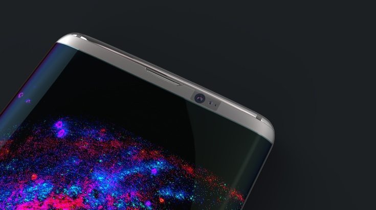
The Samsung Galaxy S7 release has not even arrived yet but that hasn’t stopped one designer focusing on its successor. Today we’re showing a Samsung Galaxy S8 concept design that looks simply stunning. We wonder if readers agree or not?
From leaks so far it looks as though the Galaxy S7 will be more of an incremental yet solid upgrade. By the time we get to the 2017 Galaxy S flagship release, it might be time to mix things up a bit. That’s what designer Steel Drake has envisioned here. This Samsung Galaxy S8 concept design has panache and style in bunches, and it’s accompanied by a video for a better look.
The display wraps nicely around the sides and the handset appears to have slight curvature to both the front and back. The areas to the top and bottom of the screen have been narrowed down, and although this is a good idea for the top part, the Samsung logo at the bottom does appear a little squashed in.
There are some very nice design touches here, for example the earpiece, and we particularly like the glossy metal contrast for the top and bottom areas. Along the bottom edge there are 7 speaker holes, a SIM card slot, and audio jack. There’s something different for the reverse too, as it features a projector above the rear camera.
This Samsung Galaxy S8 concept handset measures 141mm x 72mm x 6.8mm. The designer has even imagined the box that it would come in, as well as a new logo idea, charging pad and charge translator. For more on this check out the video showing the concept that we’ve embedded below this article, or the source link below where you’ll also see many more images.
We’ve got to say that this is a beautiful Samsung Galaxy S8 concept design that we feel many readers will really appreciate. However, you might disagree. Would you like to see the real deal Galaxy S8 look anything like this vision? Drop us your comments in the box below.
Sources: Steel Drake (Behance) AND Mesut G. Designs (YouTube)
Via: Concept Phones
