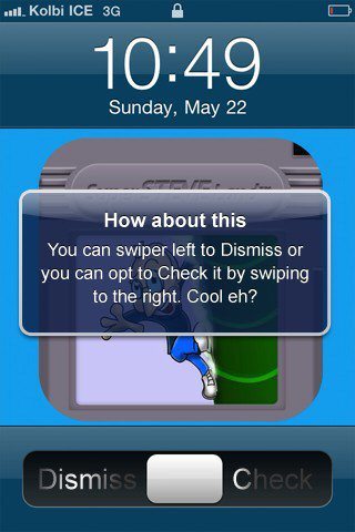
iOS 5 Slide To Unlock Notifications Concept
During WWDC 2011 in June Apple will apparently unveil their next operating system update, iOS 5 but until that time the usual speculation does the rounds as to what iOS 5 will offer the iPhone and Apple iPad faithful, other than the iPhone 3GS as apparently it wont be getting iOS 5 as reported (here) But people do come up with concepts of iOS 5 and we have one here.
According to an article over iPhone Download Blog by way of Razorianfly, @Macnavs has come up with an iOS 5 concept that takes the “slide to unlock” bar on your iphone and uses it to enable the user to either view or dismiss push notifications.
With the iOS 5 concept the grey slider has been placed in the centre of the bar rather than at the far left and would slide right to check the notification or left to dismiss it, something that does sound rather simple to use.
However its always nice to see what others can come up with in the way of concepts, but when it boils down to the nitty-gritty Apple will always do what Apple does and deliver features based on their own concepts, so this style of concept probably wont be see in iOS 5.
So we’d like to know what features our readers would like to see in iOS 5 once Apple finally gets round to releasing it, and would like you to share your thoughts to our comments area below.


Comments
4 thoughts on “iOS 5 Slide To Unlock Notifications Concept”
The distance to swipe half way could make a lot of accidental swipes to either direction, it won’t pass UI test at Apple, where they test “yeild” rates or “ambiguity”. People can’t read the “dismiss” or even worse always assumes that is slide to unlock so they now slide either way. The concept of slide to unlock then have it pop up each notification, with a tap to dismiss is still the better choice.
If you want to get creative, the multiple notifications can be seen stacked up, and you swipe the notification to dismiss it.
I don’t want this. I just want a box that holds all of my notifications. Perhaps make them selectable, meaning if I have 2 SMS messages, pressing the SMS notification will decompress and show both of the people who messaged you. This would come in handy if you were waiting on an important text from someone and could easily check to see if they had texted you or not.
This assumes the current notifications will remain. Nobody wants the crude blue boxes, we want a notifications stream (think facebook).
I think iOS5 will do things differently, if it does not then they had better have some other killer features as this part of the OS is looking a bit dated now (coming from an iPhone owner).