HP WebOS 3.0 Gets Reviewed: Videos
If you happen to be one of the webOS faithful out there you probably know that HP is planning on releasing webOS 3.0 to the mobile space on the 1st of July as a celebration of one year since acquiring Palm, and webOS 3.0 will first appear on the HP TouchPad tablet and then make its way into the smartphone arena so more people can play with it.
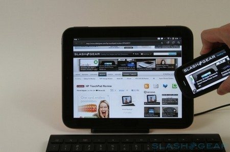
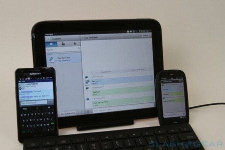
So the guys over at Slash Gear have kindly delivered quite an in-depth review of webOS 3.0 along with numerous images a few of which you can see here, and a couple of video, again which we have embedded below for your viewing consideration.
So onto that webOS 3.0 review, the guys say that when it comes to multitasking rather than overloading the home screen with icons and widgets, launching applications is achieved either by the a dedicated menu or by the bottom shortcut bar, with most of the home screen used for the webOS “cards” system whilst gesture have been preserved in this latest operating system. To cut to the chase, the guys say jumping between apps is somewhat slick and feels more dynamic than selecting an app from the Android task bar.
WebOS 3.0 Just Type is a “comprehensive system” that isn’t just for search but also content creation whereby webOS auto-queries through your history, browser bookmarks, contacts, local apps, and email headers as you begin to type, and apparently you can shoot of whatever you just typed as an IM. You’ll find a video demo of Just Type below so you can get a better idea.

Card are a big part of webOS but Synergy makes up the rest and with webOS 3.0 even more is added such as Google, Yahoo!, AIM, Facebook, Exchange, and Skype. If you already have a webOS account when you log in any third-party services you used before are automatically pulled in.
WebOS 3.0 also delivers notifications with notifications slide across the top of the display via the status bar that previews content and then collapse to icons then tapping the icons will give a look at whatever calendar, SMS or email alert has been flagged.
The guys do go quite into depth with their review and cover such things as messaging and Facebook, browser and maps, gaming and multimedia, the app catalogue, touch to share, video calling and a few extra as well, so it’s well worth paying their article a visit if you really wish to know all about webOS 3.0.
But I’ll end up here with letting you know what the guys wrap up the review with and then let you get to watching those videos below. Basically the guys feel that webOS 3.0 is a solid and capable platform and scales really well to differing sized screens, and feels most seamless and interconnected when it comes to moving between apps, handling updates and notifications and multitasking, but HP’s biggest challenge is getting developers and user to take up webOS over iOS, Android and of course Windows Phone.


Live Comment
Your email address will not be published.