Samsung Galaxy S6 vs S6 Mini vs iPhone 6S designs

The world of smartphones is extremely fast-moving and although the Samsung Galaxy S4 only recently arrived, some people are already looking ahead to the Galaxy S6 (SVI). Similarly the iPhone 5S is still to appear but an iPhone 6S has already been envisioned. Today we want to show you some designs that look to the future, of the Samsung Galaxy S6 vs. S6 Mini vs. iPhone 6S and ask which you like the look of most.
We often see some excellent concept designs for devices at Phones Review and like to share these with readers from time to time. These renders can give us a great idea of what may be coming in not-too-distant future and in this case we’re probably looking ahead to 2015.

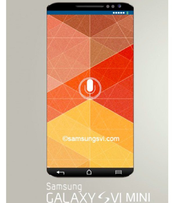
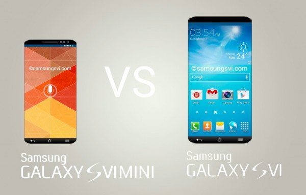
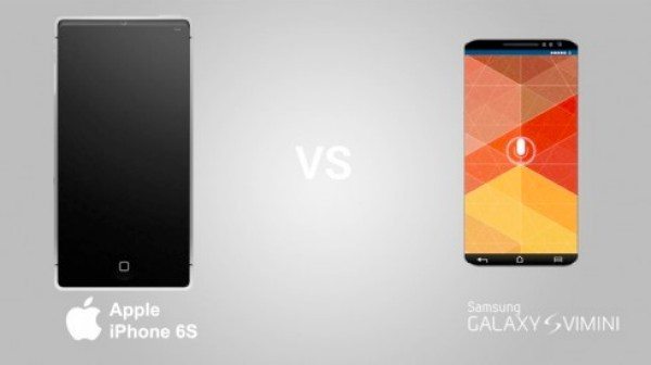
We recently showed readers a concept design for the Galaxy S6 with included specs and the same source has now come up with a Galaxy S6 Mini design. The images we are including here show the new Galaxy S6 Mini, and also the concept posing for the camera alongside the Galaxy S6 and also iPhone 6S concepts.
As you would expect, the Galaxy S6 Mini design takes its styling from that of its bigger brother and the designer has also usefully provided some imagined specs for the device. This Galaxy S6 Mini concept has either an Exynos or Qualcomm processor (no surprise there), a 4.8-inch Full HD Super AMOLED display with 480 ppi, 2GB of RAM and 16GB of internal storage, expandable via microSD to 64GB.

This S6 Mini also packs a 12-megapixel camera with 4K, a 4-megapixel front-facing camera, 2600 mAh battery and runs Android 5.0 Key Lime Pie skinned with TouchWiz, though it seems likely that KLP could have been upgraded to a new version of Android by the time a real Galaxy S6 Mini appears.
Other features are a fingerprint scanner and enhanced voice commands, and the build is an aluminum body and a back panel made from carbon fiber. We’re really interested to hear your thoughts on these concept designs from samsungsvi.com, so welcome your comments? Which of these designs do you prefer, and would you like the real Samsung Galaxy S6, S6 Mini or iPhone 6S to look like these?

Comments
7 thoughts on “Samsung Galaxy S6 vs S6 Mini vs iPhone 6S designs”
the quality of these “designs” are awful. LOL ‘The new galaxy with pixelated screen, blurry status bar and scruffy edges.’
its a concept, idiot.
It’s an extremely badly executed concept, prick. My point was that there are plenty of well designed concepts based on the edge to edge screen idea dotted around the web. It seemed strange to pick one that looks like it was done by somebodies gran on her first time playing with Photoshop.
you are the idiot by way of your reply. Its just based on his opinion.
Why not get your own opinion instead of kissing his backside.
Very ugly, how is 4.8″ a mini phone?
I hope Samsung breaks their Tradition on this Mini snd makes it a 4.7 ” Flagship with little or no compromise in Specs, including Camera, SOC, etc.
Let the S6 Mini be a 4.7″ Flagship the S6 full sized Flagship and.the Note Series for large screen fans .
Should be obvious…..