Android 5.0 visualized on video

We occasionally bring news of concept designs for smartphone as they can give a good idea of what may be offered with future devices, and we have another concept for your delectation today. This time though it’s for an operating system. A designer has looked ahead to Android 5.0 and visualized it on video, and we’d like to know what you think?
Android 4.4 KitKat looks to be on the way in October, and plenty of people are waiting with anticipation for the release of the next major Android operating system update. It’s always interesting to look a little further ahead though, and we feel that this concept of Android 5.0 is worth a look.
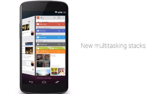
The concept develops the idea of deep system wide integration with Google Now that would replace the current notification pulldown and aims to give the right information at the appropriate time. Another aspect of the concept involves a new multitasking menu so that there would be a stacked card UI rather than a side-by-side card layout.
You’ll probably notice that there are also more white colors to the appearance. You can check out the 1-minute YouTube video below that shows this Android 5.0 concept mockup by designer Craig Tuttle. The designer has also added a nice touch to the end by striking out the 5.0 text and replacing it with 4.4.
It would be interesting to find out what readers think of this concept idea for Android 5.0. It this something you’d like to see for the real deal? Maybe at the moment you’re just itching to get hold of Android 4.4 KitKat? Let us know with your comments.

Live Comment
Your email address will not be published.