Microsoft Lumia 940 and 940 XL designs with Windows 10

Microsoft has already treated us to several new Lumia handsets including the Lumia 640 and the larger Lumia 640 XL. While these are in plenty of demand there are many buyers waiting for something a little more high-end to release. Today we’re showing Microsoft Lumia 940 and 940 XL designs with Windows 10 as flagship prospects.
Regular Phones Review readers may recall a concept design we shared in January for a Lumia 935. That came from designer Ryan Smalley who has now produced these ideas for a Lumia 940 and Lumia 940 XL. These could be the Lumias that many are waiting for, as they have top-flight camera set-ups that would seduce many buyers.
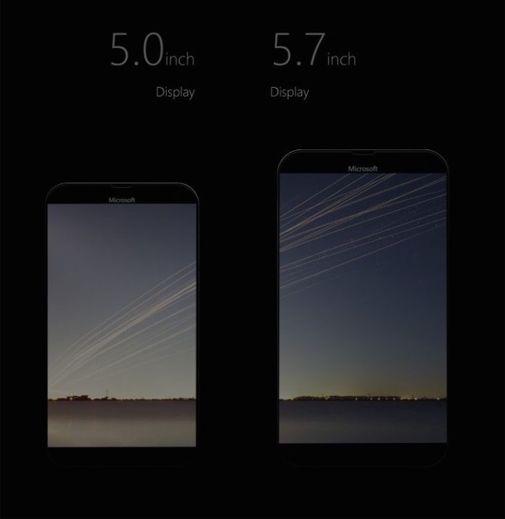
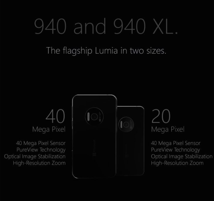
The Lumia 940 in these visions has a 5-inch display with Quad HD resolution of 2560 x 1440 and is equipped with a 20-megapixel Pureview rear camera featuring optical image stabilization, high-resolution zoom and Xenon flash. The Lumia 940 XL is the big daddy with a 5.7-inch display with Quad HD resolution and a 40-megapixel Pureview rear camera. This also comes with OIS, high-res zoom and Xenon flash.


As far as the design of the handsets they have an aluminum and polycarbonate build, and a nice touch is the polished aluminum ring area for the main camera. They appear to be almost bezel-free and very slim and the designer imagines Andesite, Obsidian and Sandstone options.
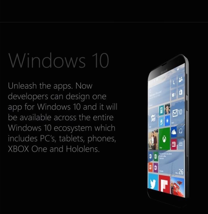
These concept visions run Windows 10 for phones bringing new-look settings, web browser, transparent UI and more. As we already know, Windows 10 will be available across the entire Windows ecosystem, including phones, PC’s, tablets and more. We’ve shown just a few of the images here but you can see more at the source below.
We’d really like to know what readers think of these design ideas for a Microsoft Lumia 940 and Lumia 940 XL? Would you like to see Microsoft produce something like these for new flagships? Drop your comments in the box to let us know.
Source: Behance
Via: Concept Phones

Comments
11 thoughts on “Microsoft Lumia 940 and 940 XL designs with Windows 10”
I’ve wanted a phone that intagrates with my LapTop for years, the Lumia 940 should fit in my top pocket so that is it. I’m not looking to replace my Digital SLR Camera or my Point and Shoot with the back-lite CMOS, so the camera feature isn’t mission critical. However I’d like the ability to use MicroSoft’s Advanced Mathmatics (graphing slide rule calculator) program, then drop my work into a Power Point presentation on any computer.
Is the back cover & battery removable?
Yes… Microsoft needs to do this and join LG in keeping this an essential feature.
Not sure. No dedicated windows buttons below the screen? I think that would be a shame. And being a flagship, you shouldn’t have to compromise on camera quality just because you prefer a smaller screen. I like the small bezels and the surface-style body though. Looking forward to seeing how close to the actual design this will be.
I agree with regards to the buttons. A flagship device should have physical capacitative buttons. The on-screen buttons are about making it cheaper to produce devices, especially for Android handset manufacturers. We don’t want cheap in a flagship Lumia though. I’ve bought a Lumia 530 Expressly for testing out Windows 10 and as a development devicde and I hate using the on-screen buttons compared to my Lumia 925.
With regards to the camera, I think it depends on whether they want to make a 1040 as well. If they do then I think a ~20mp camera in a 940 is fine. It’s up there with the highest res flagship devices from other manufacturers and they can then really go for broke on the 1040. If they aren’t looking at a 1040 then I think that they should put their best camera in the 940.
I feel like the 640XL might be the replacement for the 1320 so I also wonder there will be a 1540 or a 940XL to replace the 1520. Personally, I like the idea of a 940XL that is a bit more refined and maybe a 1520 that has a more traditional Lumia look and feel.
On-screen buttons are also about being able to update the look. Windows 10 soft keys might look different, meaning that phones with physical buttons won’t have the new look. Also, do on-screen soft key Windows phones have haptic feedback when you press the softkeys?
I have a Lumia 925, which was released with Windows Phone 8.0 and has hardware buttons. I also have a Lumia 530, which is running Windows 10 Mobile Insider Preview and had software buttons. Both look pretty much exactly the same at the moment, except that the Back and Search icon proportions are slightly different and look better on the 925. Unless they choose to support theming that affects those buttons, I don’t see an issue. Personally, I think that the hardware buttons provide a more premium experience and are therefore more appropriate for a flagship device.
Yes, the software buttons do provide haptic feedback.
The 930 was allegedly a flagship (in reality it was a rebrand of the “budget flagship” Lumia Icon designed for Verizon) but it compromised on the screen and lost a lot of potential users due to no Glance (Glance, Qi and a great camera are the holy trinity of Lumia).
Lumia 940 and 940XL? Bah, more like 940XL and 940XXXL, seriously why is it so hard for microsoft to understand some of us want a high spec phone that we can use with one hand. The 920 was perfect but the 930 was too big and the 830 isn’t noticeably better on specs. Looks like I am going to have to go with a Sony compact or a used Lumia 1020 for my next upgrade, shame 🙁
Wants the precious now, we does…
My 1520 met an untimely end after a 4-foot fall to concrete a week after my protective case wore out. It’s gonna pain me to take the HTC One M8 w/ WP that the insurance company wants to give me after having the 20MP camera which I use quite often with my job. But, with this lovely thing waiting for me at the end of my contract, I guess I can tough it out a few more months.
I will admit, though, that I’m a little on the fence about not having a dedicated Windows button myself. While I understand that it’ll probably be more cost-effective that way while also allowing for more screen space, having that separate from the screen just felt more better.
I think all flagship windows phone will have physical capacitive buttons so there will be no problem as some body thinks here