Yu Yureka Plus design and specs steps up the style: Updated

From time to time we enjoy sharing concept ideas as tantalizing prospects for new smartphones, and the one we are showing today will be of particular interest to our many readers in India. The Yu Yureka made by well-known Indian maker Micromax, as well as its Yu Yuphoria successor, have been extremely popular devices. Now we have a Yu Yureka Plus design and specs that steps up the style. We’d like to know what you think of this new Yureka render.
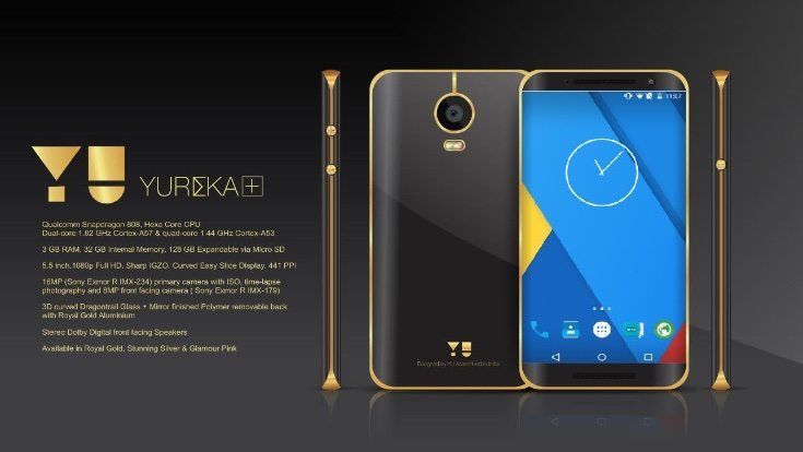
The Yu Yureka released at the beginning of the year and was an instant hit with consumers looking for a value for money smartphone. It was recently joined by the Yu Yuphoria, and now one designer has imagined a beefed up version of the Yureka in the form of the Yu Yureka Plus, seen here as the Yu Yureka+. It comes from Nilesh Chaudhari and is a more premium looking handset with a gold colored frame for those who like a touch of luxury.
As you can see the design differs in several ways from the original Yureka. The rear camera has been moved to the center and the Yu branding is now repositioned at the bottom of the reverse rather than the top. The display has curved edges, a little like the Samsung Galaxy S6 Edge and the whole handset looks to be higher quality. The build users 3D curved Dragontrail glass and there’s a mirror finished Polymer removable reverse with Royal Gold Aluminum.
The designer of this concept vision has also come up with imagined specs for the device. This Yu Yureka Plus is powered by a Snapdragon 808 hexa-core processor (two cores at 1.82GHz and four at 1.44GHz), with a 5.5-inch Sharp IGZO display with Full HD resolution of 1920 x 1080 and 441 ppi. There’s 3GB of RAM and 32 GB of internal storage that can be expanded via microSD to 128GB.
It has a 16-megapixel rear camera featuring a Sony Exmor R IMX-234 sensor and time-lapse photography, as well as an 8-megapixel front-facing camera with Exmor R IMX-179 sensor. The Yureka+ also features stereo Dolby Digital front-facing speakers and would come in Royal Gold, Glamor Pink or Stunning Silver color options.
We wonder what readers think about this Yu Yureka Plus smartphone concept? Would you like to see a premium Yureka handset featuring this kind of design and specs? We’re always interested in comments from readers so do please let us know.
UPDATE: The real Yu Yureka Plus has just been announced and you can read all about it here.

Comments
14 thoughts on “Yu Yureka Plus design and specs steps up the style: Updated”
fake where is saturn ring on camera ? hahahahahahahahahahah
Yeah!
It’s good, but the gold line from the boundary to the camera circle looks odd. And even the front design looks rather over-glittering but nowhere like stylish and posh – I mean the gold appearing there doesn’t look good. And black with silver would look more awesome, and so would white with gold.
Specs wise, it’s just cool!!!!
This is not true.. Just a rumor, don’t believe that the design is going to be true..
What will be the approximate cost?
When it is going to launch the phone……..please let me know, im very excited….!!!
20th of july. which is tomorrow.
cmn……plzzz reply u guyzzz…!!!
This is not true! 😀
The image is totally wrong and I know it! 😉
On which time it will be lunch am waiting
since samsung launch of galaxy s6 edge. all the phone concept designs has the same edge type display. which i realy dont like. it is useless to have that display.
Someone please tell me whether should i buy yureka plus or lenovo k3 note…both are almost equal in specs thats why i m confused which one will make my day..plse help me.
LENOVO K3 NOTE HAS E COMPASS TOO SO GO FOR IT.
I BOUGHT YUREKA PLUS BECAUSE I WANTED CYANOGEN.
BOTH LACK FAST CHARGING.
Okk bro thanx…well i have already purchased k3 note..:D 🙂