Nokia Ember smartphone design features curvaceous style

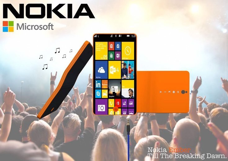
Part of Nokia’s deal with Microsoft last year for the Lumia branding was that the former would not be able to come up with any new smartphones until 2016. Many people are eagerly waiting to see what Nokia will produce, and we’ve already heard rumors of new Nokia smartphones in the pipeline. In the meantime we can tantalize ourselves with prospects, and the Nokia Ember phone design we’re sharing today certainly features curvaceous style.
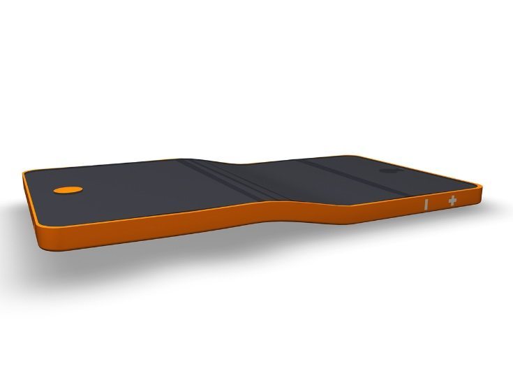
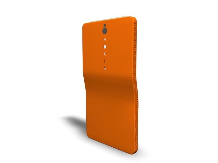
Recently we shared another Nokia concept idea, and this latest vision comes from designer Eoin Bracken. It’s imagined as being the next-generation Nokia phone. For those who want to see a new design twist from the company this could definitely fit the bill. The renders show a handset with what the designer describes as “organic curvature,” and the final vision features some interesting bends. Unlike recent “bendgate” sagas this styling is deliberate, and while it may not be everybody’s cup of tea we find it quite appealing.
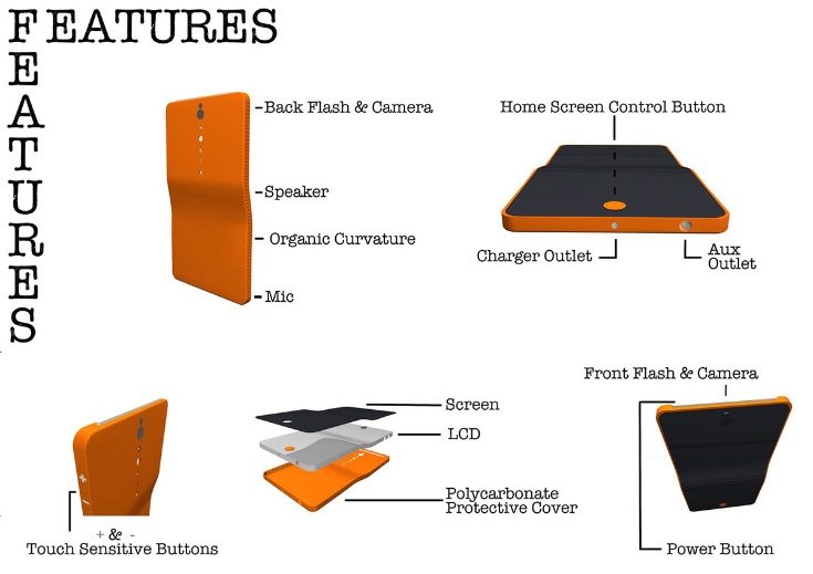
There’s curvature for the polycarbonate casing as well as the LCD panel and screen. The Nokia branding is shown running vertically on the reverse. This creation looks as though it has an edge-to-edge display, and the speaker runs down one of the side edges. On the other side the volume buttons are represented simply as plus and minus signs, and there’s a rather prominent extended power control across the top edge.


We’ve shown just a few of the Nokia Ember renders here and you can see many more at the source below. Apart from the finished renders you’ll also see the design process throughout, and different ideas that were thought of along the way. The designer hasn’t provided envisioned specs for this creation. However, you can probably come up with your own ideas of what you’d like to see.
As this is a little different to many concepts we see, we’re really interested to hear what readers think of this Nokia Ember smartphone. Do you admire the rather unique appearance of this Nokia handset? Perhaps you think the curvature is a step too far? Do let us know with your comments.
Source: Behance
Via: Concept Phones

Comments
2 thoughts on “Nokia Ember smartphone design features curvaceous style”
Have they been smoking drugs or something
I think it’s a very sexy design- but surely the curvature must have some function – and what that might be I have no idea. Is it easier to hold? That would be a definite improvement, speaking as someone whose phone flies out of his hand like a tiny greased pig about 100 times a day…