Microsoft Mico Windows 11 design gives ideas

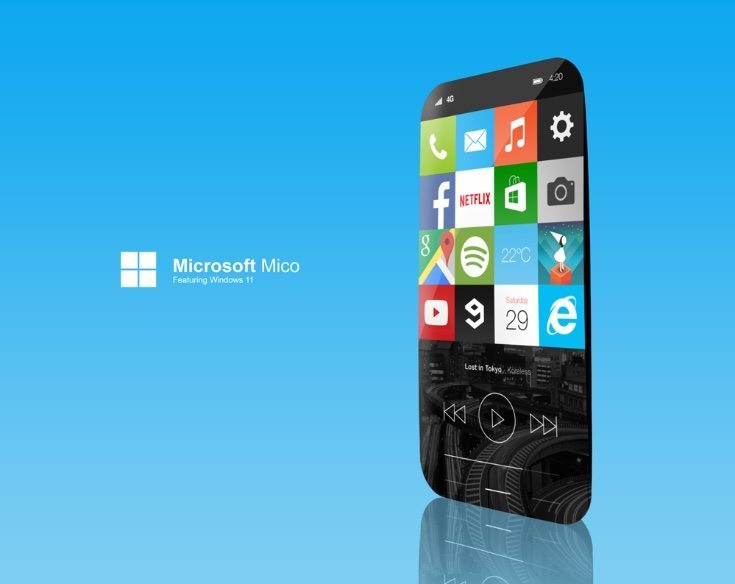
There’s plenty of buzz right now about Windows 10 for mobile but some are already looking further ahead. It can be tantalizing to look at ideas for upcoming devices as well as operating system versions, and one designer has created the Microsoft Mico Windows 11 design that we’re showing here.
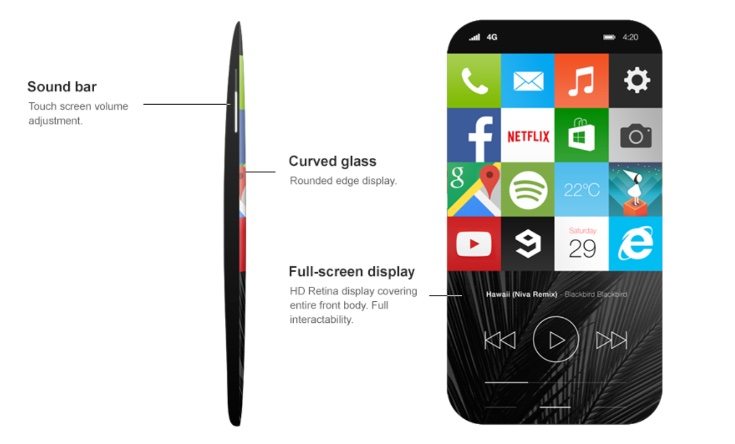
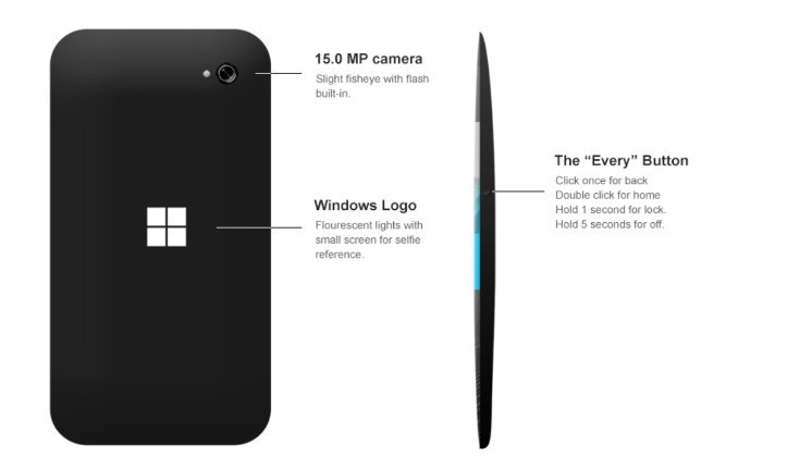
Thisconcept design depicts Windows 11 for mobile on a Microsoft Mico smartphone. Its creator Viktor Hammarberg has come up with plenty of interesting ideas for Project Mico features. Specs include an HD retina display that covers the whole of the front body, and there’s a 15-megapixel rear camera including “slight fisheye with flash built in.” There are also up to Freq 20Hz HD speakers and curved glass with rounded edges for the display.
The most interesting ideas are reserved for Windows 11 for mobile, with a new UI and the return of tiles. There’s also an ‘Every’ button. If this is clicked once it functions as a Back button or if double-clicked it’s utilized as a Home button. Holding the button for 1 second will lock the handset or it can be turned off by holding the button for 5 seconds.


Even the Windows logo on the reverse of the Microsoft Mico offers a nice twist, as it features fluorescent lights and can double up as a small selfie reference screen. The designer has also imagined a Home screen where the rows of apps can be scrolled through line-by-line rather than whole pages. A general control area can be accessed by swiping up from the bottom of the display.
Further additions are Windows Live, Music hosting software, and a Lock screen that shows notifications. This has a circle control that users can customize the position of. The handset features a sound bar on one edge for touch screen volume adjustment. We’ve included a few of the designer’s images here and you can see more renders at the source below.
We’d be interested to hear what you think of this Microsoft Mico and Windows 11 concept so do send us your comments. Maybe you have your own ideas about what you’d like for a new Microsoft smartphone running Windows 11 for mobile?
Source: Behance
Via: Concept Phones

Comments
9 thoughts on “Microsoft Mico Windows 11 design gives ideas”
That’s hideous. The UI looks terrible and the phone looks hard to use. There’s no bezel, which makes it far too easy to accidentally press the screen. It’s too curved, which means it won’t be stable on a flat surface. The “every” button is a bad idea. No one wants to have to double-click just to get to the home screen, and holding to lock the phone is an unintuitive, slow interaction, not to mention the fact that home and back buttons should be on the front of the phone. Additionally, this hides Windows’s killer feature, Cortana, behind the start screen or app list.
this was just a 2 day personal project i did for fun while staying at my parents, and i decided to share it. sorry to hear you don’t, but please remember this concept is not a statement, or a suggestion, it’s just for fun.
you didn’t even get the windows logo right. that’s the Microsoft logo, not windows.
i did that on purpose actually cuz i think the windows logo is not even remotely aesthetic, twas a compromise
Then don’t call it the windows logo.
I think this is a great idea, especially the effect of full-screen display and taking pictures. Makes the phone look transparent.
I also like the home screen concept, although i think the scrollable lines idgea, although innovative, won’t prove that useful. I personally enjoy scrolling the home screen, especially when it’s unconjested with icons.
I agree with Telogor on the curved back issue. Typing on the phone while it is on a table will probably prove irritating at some point.
If this phone would be fast with many features from the PC, this could be a success.
Keep storming that brain (V)
When this will be lunch? I am eagerly waiting to buy this one.
I have one confusion , do this mobile have front camera ? ll be waiting for response .
Where is frontal camera?