Microsoft Lumia Pad design with specs that would have impressed

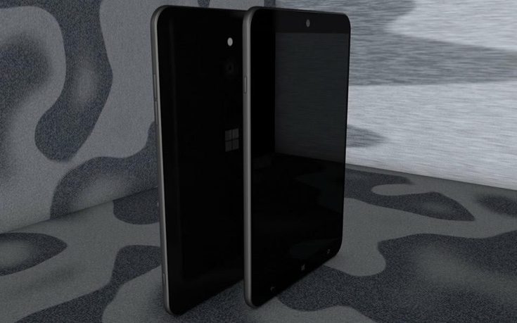
There are many fans of Lumia devices and the Microsoft Lumia 650 smartphone is expected to be the next that will launch. Unfortunately there is increasing speculation that this could be the last ever Lumia release. That’s not enough to stop concept designers creating new ideas though, and this Microsoft Lumia Pad design shows a large tablet with specs that would have impressed.
Usually when we see concept ideas for future devices they tantalize us with prospects of what could come. However, with the growing rumors that the Lumia line is about to die out, this Microsoft Lumia Pad tablet concept is sadly too late to the starting line. It comes from designer Armend Lleshi who has also produced the video to accompany it that you can view below this article.
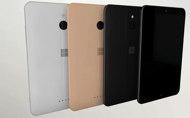
The Microsoft Lumia Tab has a premium build that looks as though it could be metal, and it’s just 6.9mm thick. It has rounded corners and the bezels either side of the display are nicely slim. The designer shows it in color choices of black, gold, and white. Desirable specs include a 9.2-inch display with 4K resolution, a whopping 6GB of RAM, and internal storage options of 32GB, 64GB, or 128GB.


It’s equipped with a 13-megapixel camera with Full HD video capture on the reverse, and up front there’s a 5-megapixel front-facing shooter with HD video recording capability. Another inclusion for this Microsoft Lumia Pad concept is a USB Type-C port for faster charging. Do check out the Lumia Pad 2016 trailer video below for a further look.
If you enjoyed this Armand Lleshi concept design you might also be interested in some previous ideas from the same designer, for example a Sony Xperia Z6 Premium or a video that he produced for a Microsoft Lumia 940 XL design from last year. We’d like to hear what you think of this Microsoft Lumia Pad design idea. Would you have liked something like this from Microsoft? Are you still hoping there may be future Lumia tablets to come?
Source: Armend Lleshi (YouTube)
Via: Concept Phones
https://www.youtube.com/watch?v=8CAEIQLLgoY://

Comments
One thought on “Microsoft Lumia Pad design with specs that would have impressed”
Looks too much like an iPad – missing the designs of Lumia old. Needs bright colors and rounded edges like the 2520 tablet had.