Samsung Galaxy S8 Design keeps things simple in new Concept Renders

Out of all the brands designers can tackle, Samsung is a favorite. The Samsung Galaxy S8 design is back on our minds today thanks to a new render that shows you don’t have to make drastic changes to make a big impact.
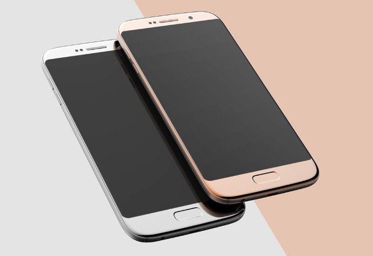
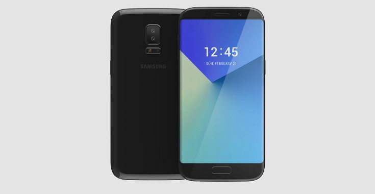
We enjoy wild concept phones although sometimes simple can be just as striking. The Samsung Galaxy S8 design doesn’t have to be totally overhauled to get consumers attention and designer Kyuho Song feels the same way. Ss you can see from the photos showing his vision of the Samsung Galaxy S8, sometimes simple is quite nice…
Song’s design for the S8 includes a bit of an edge on both sides of the handset. You can see a smooth curve on the front of the device but not a full “edge” like we usually get. The bezels are still slim and the back of the handset features a more distinct curve. The home button is still present but recessed which means the sensor/home button combo may know a few new tricks.

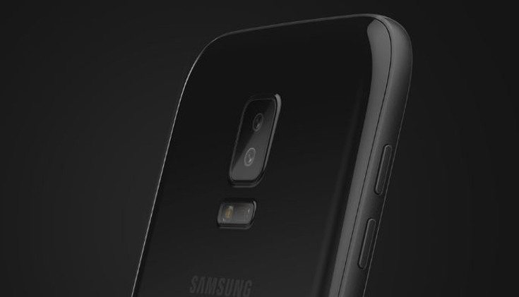
A closer look at the Samsung Galaxy S8 design concept shows it will have a USB Type-C port and the old 3.5mm headphone jack. The rear camera has been redesigned with the flash array coming below the sensors which have been doubled up. We don’t know the size or any of the potential specs behind this beauty but it would have to be beastly to live up the Galaxy S moniker.

Just like the S8 concept we showed you last week, Kyuho Song’s Samsung Galaxy S8 design is one that could actually be produced. The changes are subtle but strong enough to grab consumers attention without breaking the bank to implement them.
via – Concept Phones source: Kyuho Song (Behance)

Live Comment
Your email address will not be published.